MAXQDA lets you create frequency tables and corresponding charts for document variables, code variables, and focus group speaker variables. You can open this function from the ribbon menu:
- Variables > Document Variable Statistics
- Variables > Code Variable Statistics
- Variables > Speaker Variable Statistics
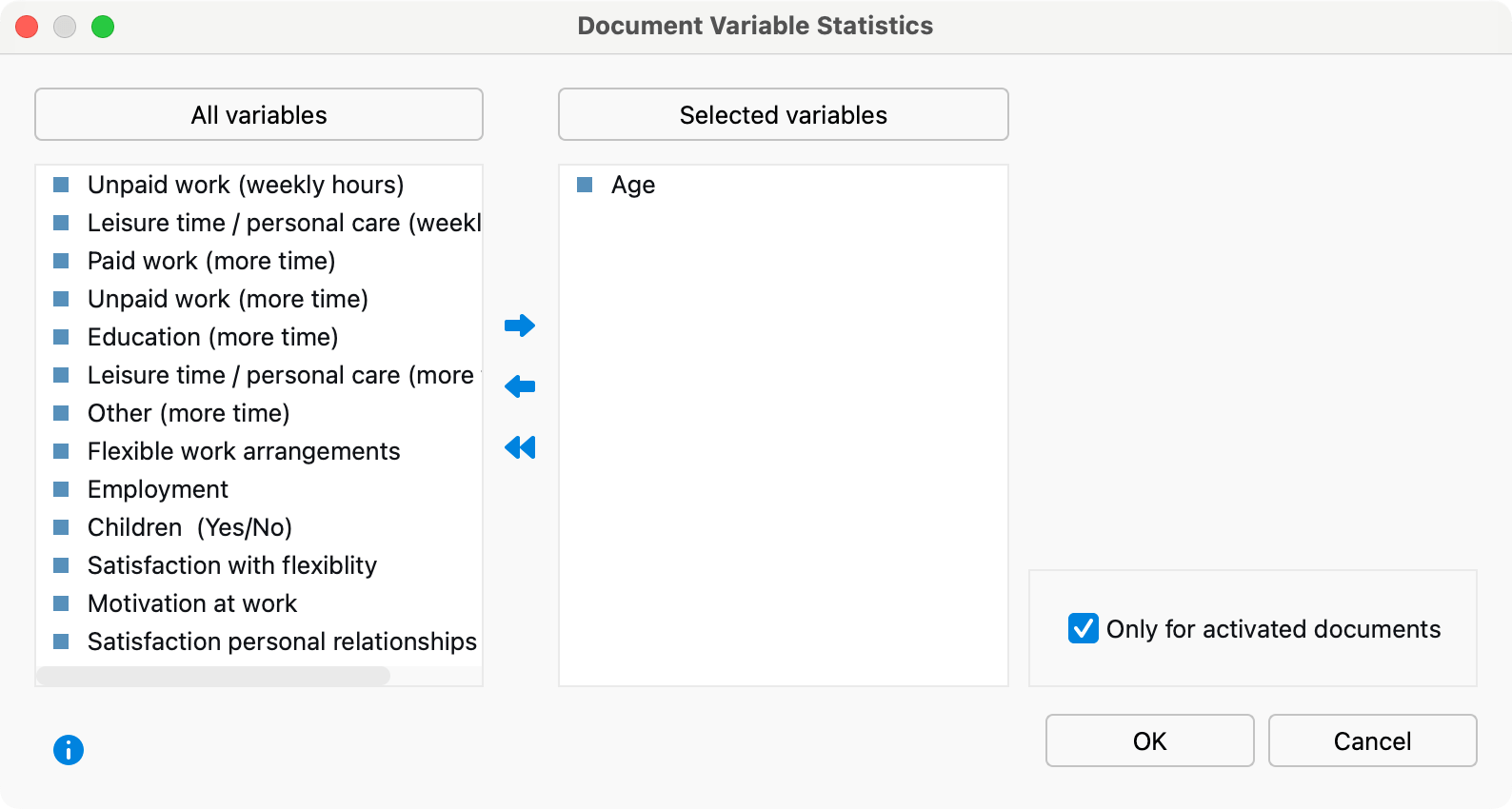
After you click on one of the variable statistics options a split “Choice of Variables” window is displayed: Existing variables are listed on the left side; already selected variables are moved to the right. The arrow buttons in the middle allow you to transfer variables from one window to the other. You can also do this by double-clicking on the variable name.

Both lists can be alphabetized by clicking on the column headers. By selecting Only activated documents you can limit the analysis to currently activated documents, for example the transcripts of selected interviewees. The corresponding options Only activated codes and Only for activated focus group speakers are also available for code variables and focus group speakers variables.
When you click OK MAXQDA will begin the statistical evaluation and display the results as frequency tables and charts.
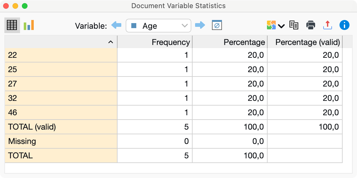
The results window displays the results of the first selection of variables in a table. The “Frequency” column shows how many of the analyzed documents contain the variable value in question.

The first column lists the various categories of the variable; the second column lists the absolute frequency; and the third lists the corresponding percentages. The fourth column shows percentages based on valid values, meaning missing values are excluded. If there are no missing values among the variables in question, the percentages of the third and fourth columns will be identical.
You can sort the rows by clicking on the column header of the first or second column.
Charts
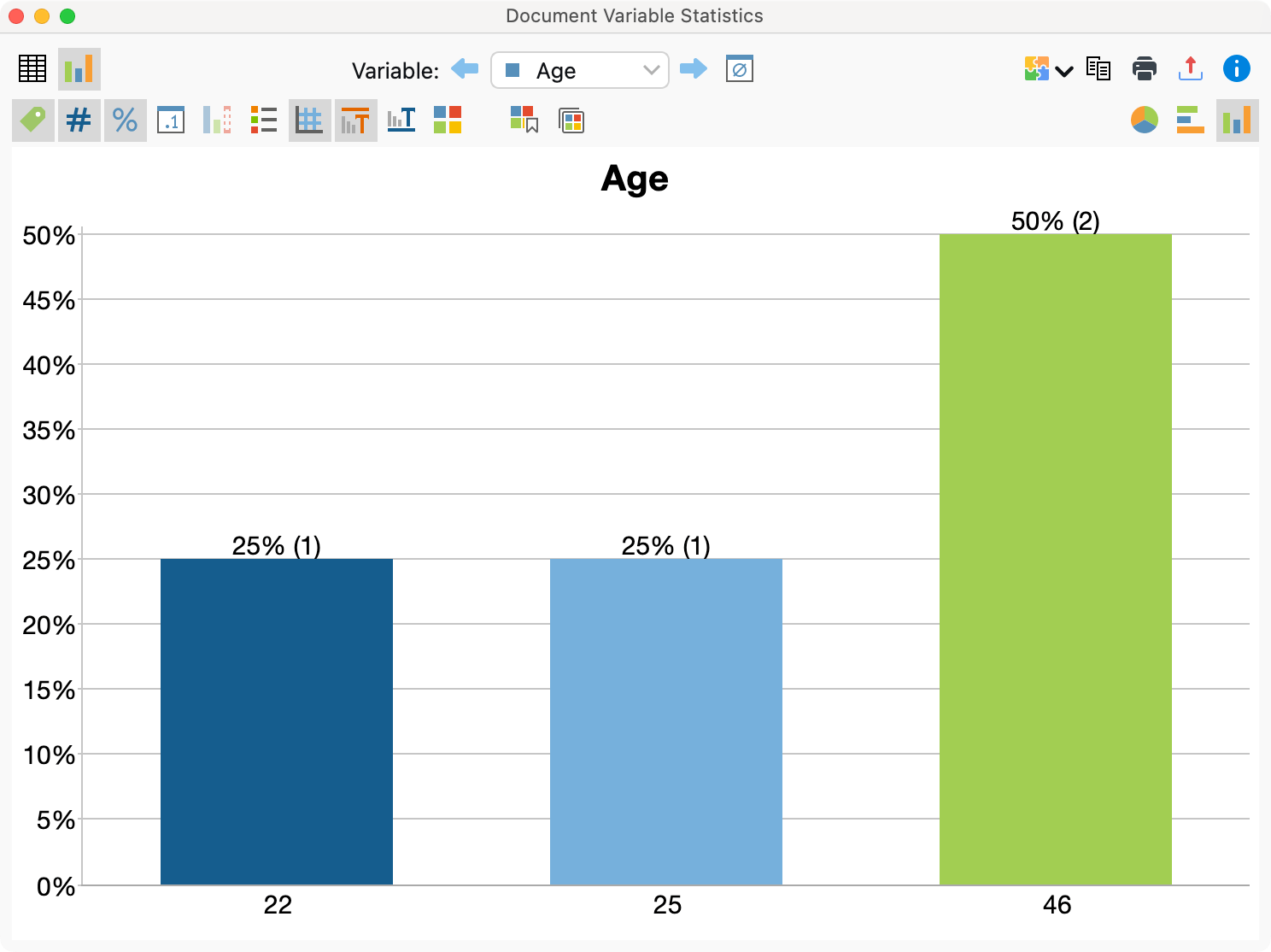
When you switch to the chart view by clicking the chart icon in the toolbar, a bar chart of the variables in question appears in the place of the table view.

You can customize the chart regarding colors, fonts, etc. in several ways and you can export it in different formats or copy it to the clipboard. For more information on customizing the chart, see section Frequency Tables and Charts for Top-Level Codes and Subcodes.
Missing values in frequency tables and charts
MAXQDA will treat the following as missing variable values:
- For numerical and text variables, values set as “Missing values” in the “List of Variables” will be treated as missing.
- For text variables, blank fields will also be treated as missing.
Descriptive statistics
When evaluating numerical variables, the Descriptive statistics symbol appears in the top toolbar. Clicking on the icon produces an output of the usual parameters such as including mean value and variance.
