You can use MAXQDA to see how often codes appear in selected documents. The results can be displayed as a table or chart. You may focus on top-level codes, the subcodes of a parent code, and optionally include deeper subcode levels.
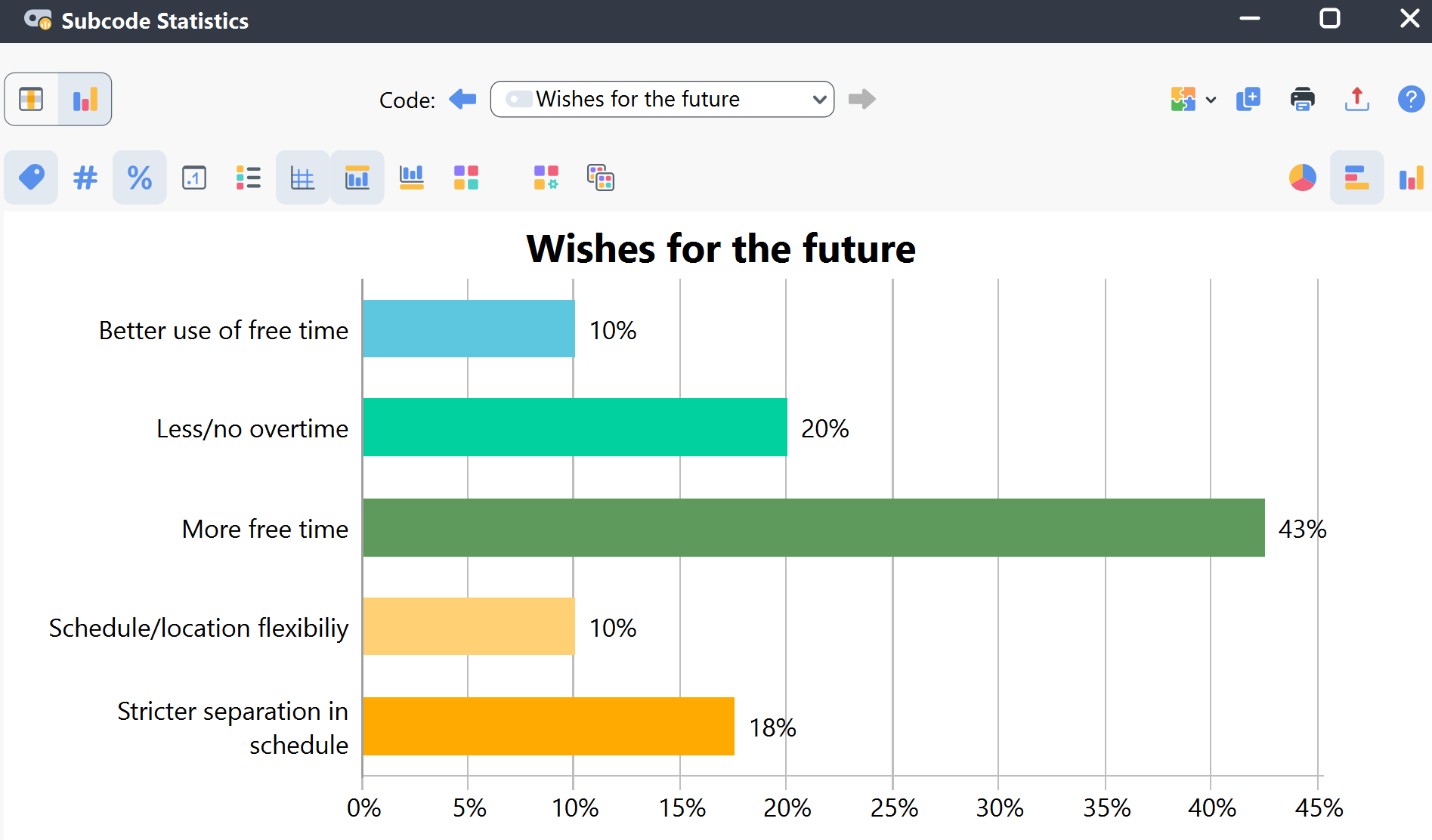
Analyzing Subcode Frequencies
To start, open Codes > ![]() Code Statistics > Subcode Statistics. The following window opens:
Code Statistics > Subcode Statistics. The following window opens:
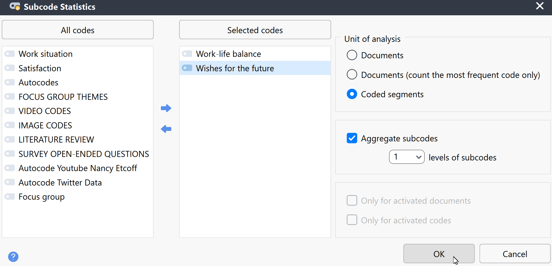
On the left side of the dialog, all top-level codes from the Code System are displayed. Select a code by clicking the arrow or by double-clicking it. You can also sort the list alphabetically by clicking the column headers.
On the right, you can set the analysis options:
-
Unit of analysis
- Documents – Counts how many documents contain the selected subcode. Example: “How many cases mention a particular topic?”
- Documents (count most frequent code only) – Counts how many documents contain the subcode most frequently. Example: “In how many cases does this topic dominate?”
- Coded segments – Counts the number of coded segments per subcode.
- Aggregate subcodes – Includes not only the direct subcodes of the selected parent code but also lower-level codes down to the specified level. All lower-level codes are aggregated to the parent code and displayed as a single entry in the results table.
You can also limit the analysis to currently activated documents and codes by selecting the corresponding option.
Click OK to run the analysis.
Navigating the results table
If one of the two options for "Documents" was selected for "Unit of analysis," the results table will contain the following rows:
| Code "A" | Number of documents in which code "A" occurs |
| Code "B" | Number of documents in which code "B" occurs |
| Code "C" | Number of documents in which code "C" occurs |
| not defined | Number of documents in which there is no most frequent code because several codes are equally frequent |
| DOCUMENTS with code(s) | Number of documents in which AT LEAST ONE of the evaluated subcodes occurs |
| DOCUMENTS without code(s) | Number of documents in which NONE of the evaluated subcodes occur |
| ANALYZED DOCUMENTS | Total number of documents evaluated |
The "not defined" row is visible only if the "Documents (count most frequent code only)" option is selected.
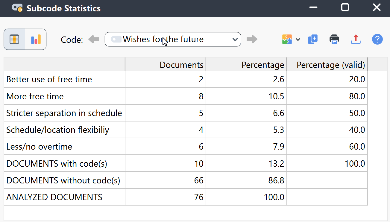
The "Percentage" column is based on all analyzed documents, while the "Percentage (valid)" column is based only on the "Documents with code(s)."
When you select the option "Coded segments" for "Unit of analysis," the results table contains the following rows:
| Code "A" | Number of coded segments with code "A" |
| Code "B" | Number of coded segments with code "B" |
| Code "C" | Number of coded segments with code "C" |
| TOTAL | Sum of coded segments. |
The codes in the results table follow the same order as in your Code System tree. If you prefer, you can toggle the table columns to sort in ascending or descending order by clicking on the column headers. To return to the original order, right-click the table header and select Reset Sorting.
Toolbar functions
![]() Chart view – Displays the results of the frequency table as a chart (this function is described in detail below).
Chart view – Displays the results of the frequency table as a chart (this function is described in detail below).
![]()
![]() Next/Previous – Switches to the previous/next results table if multiple parent codes have been selected for the analysis.
Next/Previous – Switches to the previous/next results table if multiple parent codes have been selected for the analysis.
Analyzing top-level code frequencies
You can also generate statistics for top-level codes instead of subcodes. To do this, go to Codes > Code Statistics > Top-Level Code Statistics.
The options dialog works the same way as for subcode statistics, except that no parent code selection is required.
The resulting table also functions in the same manner as the subcode statistics table.
Navigating chart view
Once you have switched to the chart view by clicking on the ![]() icon, the results from the frequency table are visualized as a chart.
icon, the results from the frequency table are visualized as a chart.
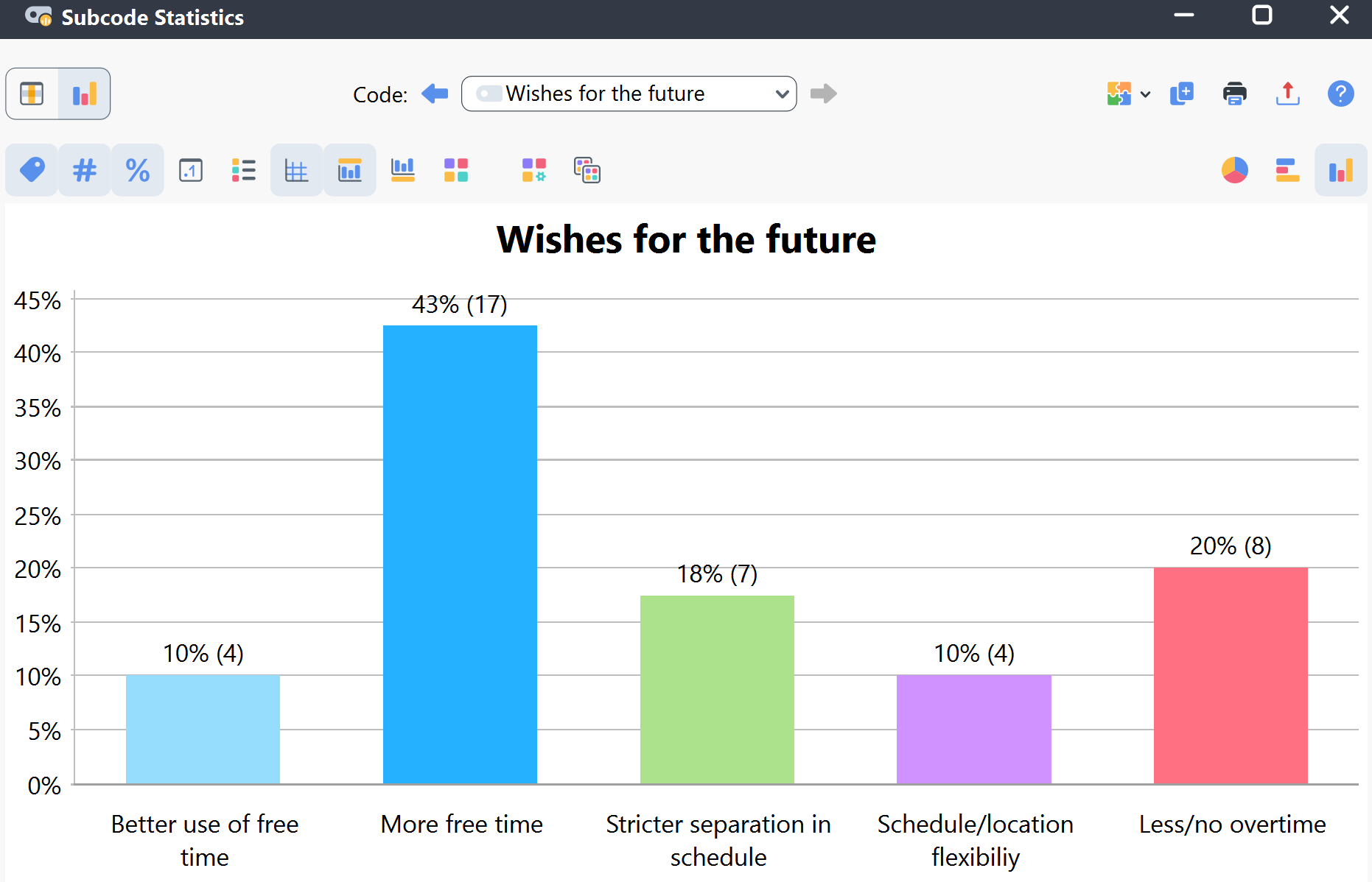
You will see two toolbars at the top of this window. The upper toolbar is the same as for the frequency table, and you can switch at any time to the table view. On the right side of the lower toolbar, you will see three buttons, with which you can choose between pie chart, horizontal, and vertical bar chart. The chart can be customized using the options in the lower toolbar:
![]() Display labels – Show categorical labels of bar and pie charts.
Display labels – Show categorical labels of bar and pie charts.
![]() Display absolute values – Show absolute frequencies.
Display absolute values – Show absolute frequencies.
![]() Display percentages – Show relative frequencies.
Display percentages – Show relative frequencies.
![]() Display decimals – If percentages are displayed, the values are shown with one decimal.
Display decimals – If percentages are displayed, the values are shown with one decimal.
![]() Display missing values – Show missing values category.
Display missing values – Show missing values category.
![]() Display legend – Show the legend, which is switched “off” by default in bar charts.
Display legend – Show the legend, which is switched “off” by default in bar charts.
![]() Display scale – Show the scale axis in bar charts.
Display scale – Show the scale axis in bar charts.
![]() Display title – Show diagram title.
Display title – Show diagram title.
![]() Display text – Show textual description of diagram.
Display text – Show textual description of diagram.
![]() Change color scheme – Open the window for color scheme selection.
Change color scheme – Open the window for color scheme selection.
![]() Set as default design for new diagrams – Save the current design and automatically apply it to new charts.
Set as default design for new diagrams – Save the current design and automatically apply it to new charts.
![]() Apply current style to all created diagrams – Apply the current style to all currently created charts.
Apply current style to all created diagrams – Apply the current style to all currently created charts.
![]() Pie chart – Switches the display to a pie chart.
Pie chart – Switches the display to a pie chart.
![]() Horizontal bar chart – Switches the display to a horizontal bar chart.
Horizontal bar chart – Switches the display to a horizontal bar chart.
![]() Vertical bar chart – Switches the display to a vertical bar chart.
Vertical bar chart – Switches the display to a vertical bar chart.
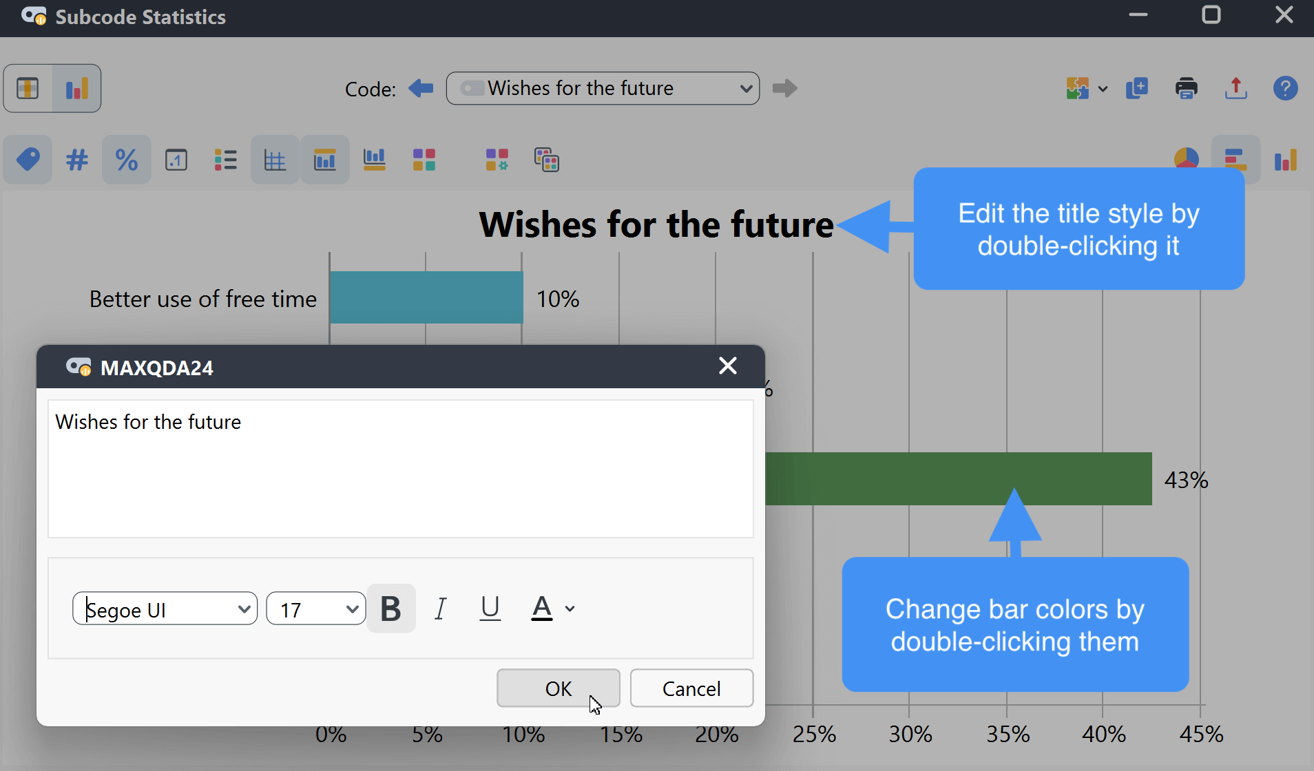
Customizing charts
You can double-click:
- a bar or pie segment to change its color.
- the title, description, or category labels to edit the text and adjust the font.
- the axis labels to change their font. For the size axis, you can also adjust the height.
Storing results in a QTT Worksheet
In the Questions – Themes – Theories window of MAXQDA, you can collect and comment on all the important results of your project. In the upper right corner of the table or chart view, click on the icon ![]() Send to QTT Worksheet to store the results in a new or existing worksheet. The current display will be saved as an image.
Send to QTT Worksheet to store the results in a new or existing worksheet. The current display will be saved as an image.
Printing and exporting results
![]() Copy to clipboard – Copy the current table or chart to your clipboard.
Copy to clipboard – Copy the current table or chart to your clipboard.
![]() Print – Print the current view directly.
Print – Print the current view directly.
![]() Export – Save the current view as a file.
Export – Save the current view as a file.
