With MAXQDA you can create frequency tables and charts for subcode frequencies. You can open this function in the ribbon menu via Codes > Subcode Statistics.
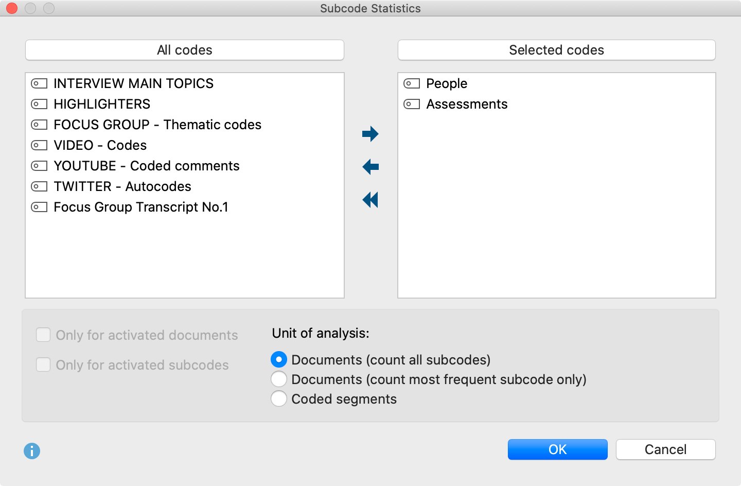
The split “Choice of Codes” dialog box: on the left side, all existing codes that have subcodes are listed; on the right side your selected codes appear. In the middle, arrow buttons allow you to transfer codes from one window to the other. You can also do this by double clicking on a code. Click on the column header of either list in order to alphabetize content.
For codes containing subcodes, this function can also be called up directly from the Code System. Right-click on the code and select Statistic of subcodes. In this way, you can also access the statistics functions for codes that are not at the top level of the code system.
The analysis can be restricted to currently activated documents and subcodes. To do so, check the appropriate boxes.
Selecting units of analysis for statistical evaluations
At the bottom of the screen, you will find options for the unit of analysis. The following options are available:
Documents (count all subcodes) – This option corresponds, in principle, to an evaluation of multiple responses. In this case, the analysis is performed assuming that when several subcodes can be coded in a document, the subcodes are not mutually exclusive. MAXQDA analyzes the number of documents to which a subcode has been assigned. All subcodes that occur in a given document will be counted, on a per-document basis. This type of analysis would typically be employed to answer the question "What percentage of cases (= documents) mention the theme (= code) XY ?".
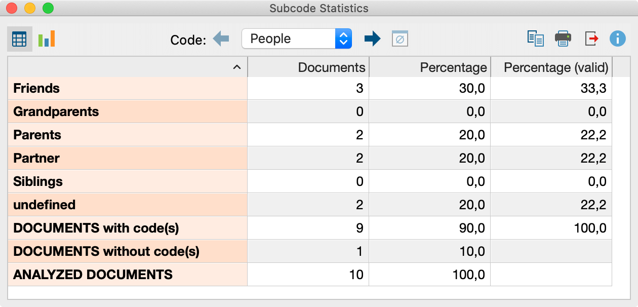
Documents (count most frequent subcode only) – In this case, the analysis is performed under the assumption that subcodes are mutually exclusive, meaning that subcodes can be interpreted as categorical variables. On a per-document basis, only the subcode that occurs most frequently is taken into account. If two or more subcodes occur with the same frequency within a document, a new “not defined” category will appear.
Coded segments – This option analyzes the number of coded segments per subcode.
Once you click OK, MAXQDA begins the statistical calculation, after which the results will be displayed as frequency tables and diagrams.
The window shows the table view of the first selected variables:
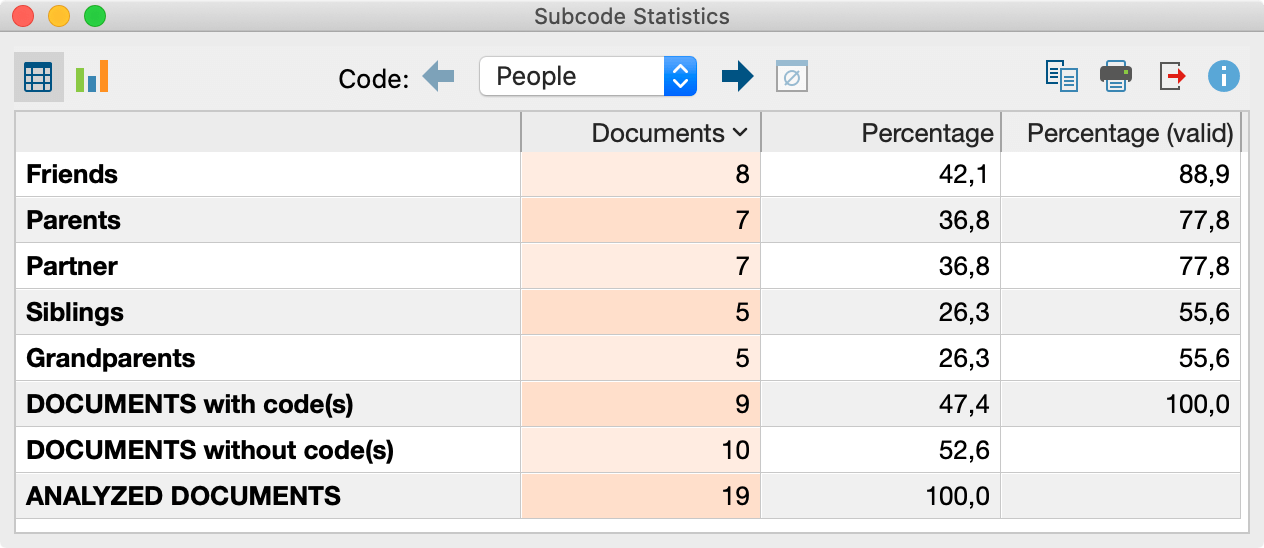
The first column of the table lists the different subcodes of the table; the second column, the absolute frequency; the third column, the corresponding percentages. The fourth column shows the percentages based on valid values, meaning documents without analysed codes are not taken into account. If there are no missing values, then the percentages will be identical in the third and fourth columns.
Table values
The meaning of the table values depends on which unit of analysis has been selected:
Unit of Analysis: Document (count all subcodes) – The table will show the number of documents in which the respective subcode was assigned. For each document, all subcodes that occur in the document will be counted. At the end of the table, the number of documents is displayed in which none of the analysed subcodes occur.
Unit of Analysis: Document (count most frequent subcode only) – The table will show the number of documents in which the respective subcode was assigned. Subcodes are mutually exclusive. For each document, only the most frequently occurring subcode will be counted. At the end of the table, the number of documents is displayed in which none of the analysed subcodes occur.
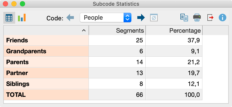
Unit of Analysis: Coded Segments – The table will show how often a subcode was assigned, meaning how many coded segments exist for this code.

| Subocde "A" | Number of documents in which Code "A" occurs. |
| Subcode "B" | Number of documents in which Code "B" occurs. |
| Subcode "C" | Number of documents in which Code "C" occurs. |
| DOCUMENTS with code(s) | Number of documents in which at AT LEAST ONE of the analyzed subcodes occurs. |
| DOCUMENTS without code(s) | Number of documents in which NONE of the analyzed subcodes occurs. |
| ANALYZED DOCUMENTS | Number of documents total. |
Toolbar functions
You will see a toolbar at the top of the results window. Here you can:
- call up charts by clicking the
 icon
icon - flip forward
 or back
  between main codes
 - print results, or
- export results as an Excel file or as a Website in HTML format.
Charts
Once you have switched to the Chart view by clicking on the ![]() icon, a bar chart of the selected subcode appears in the place of the table view.
icon, a bar chart of the selected subcode appears in the place of the table view.
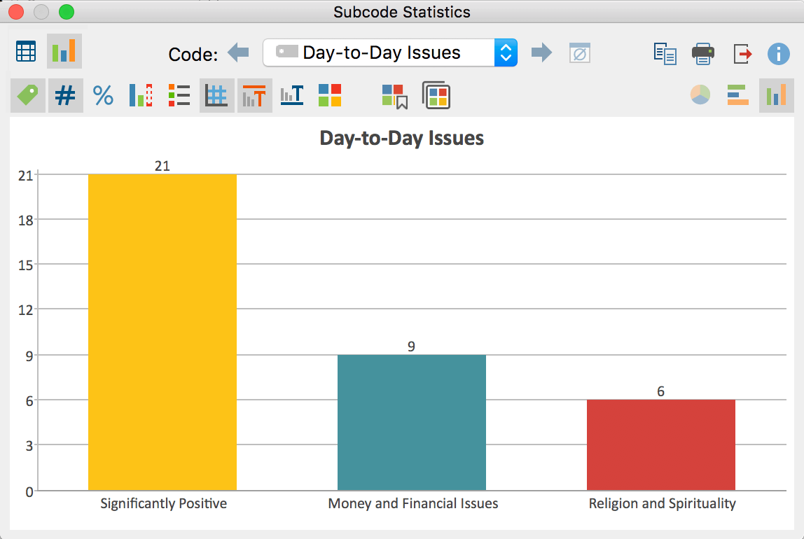
You will see two toolbars at the top of this window. The upper toolbar is the same as the frequency table, and you can switch at any time to the table view. On the right side of the toolbar you will see three buttons, with which you can choose between pie chart, horizontal and vertical bar chart. The chart can be customized using the options in the lower toolbar.
![]() Display labels – hide or show categorical labels of bar and pie charts on the x-axis.
Display labels – hide or show categorical labels of bar and pie charts on the x-axis.
![]() Display data values – hide or show the data label, meaning frequency of variable values or subcodes.
Display data values – hide or show the data label, meaning frequency of variable values or subcodes.
![]() Display percentages – show relative, rather than absolute frequencies.
Display percentages – show relative, rather than absolute frequencies.
![]() Display missing values – hide or show missing values category.
Display missing values – hide or show missing values category.
![]() Display legend – hide or show the legend, which is switched “off” by default in bar charts.
Display legend – hide or show the legend, which is switched “off” by default in bar charts.
![]() Display scale – hide or show the scale axis in bar charts.
Display scale – hide or show the scale axis in bar charts.
![]() Display title – hide or show diagram title.
Display title – hide or show diagram title.
![]() Display text – hide or show textual description of diagram.
Display text – hide or show textual description of diagram.
![]() Change color scheme – opens window for color scheme selection.
Change color scheme – opens window for color scheme selection.
![]() Save current design as default – saves the current design and automatically applies this design to new diagrams.
Save current design as default – saves the current design and automatically applies this design to new diagrams.
![]() Apply style to all diagrams – applies the current style to all diagrams.
Apply style to all diagrams – applies the current style to all diagrams.
Customizing chart captions, colors and font sizes
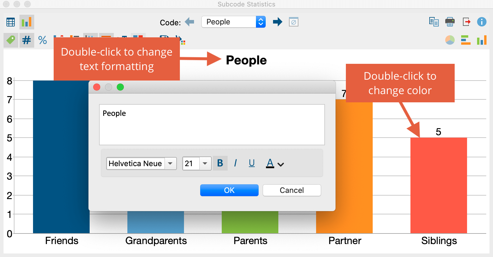
When creating charts, MAXQDA sets an initial color scheme. To customize your charts, double-click on the selected segment and choose your desired color. Click on the Change color scheme ![]() button to select from among three preset color schemes.
button to select from among three preset color schemes.
Double-click on the title or description to customize content.
Formatting, such as font, font size and font style, can be changed via the dialog window that appears when you double-click on the title, description or another label.
Printing and exporting charts
Like frequency tables, charts can be printed and exported. Charts will be exported in PNG format, or as vector graphics in SVG format. In Windows, the vector format EMF is also available, which can be enlarged without quality loss and can be easily imported into Microsoft Office programs.
