With MAXQDA you can easily create frequency tables and charts for variables or subcodes. Start the feature for document variables by clicking on the ![]() icon in the toolbar or by selecting Statistic of document variables under Variables. To create a statistic of subcodes please click on the
icon in the toolbar or by selecting Statistic of document variables under Variables. To create a statistic of subcodes please click on the ![]() icon or navigate to Codes > Statistic of subcodes.
icon or navigate to Codes > Statistic of subcodes.
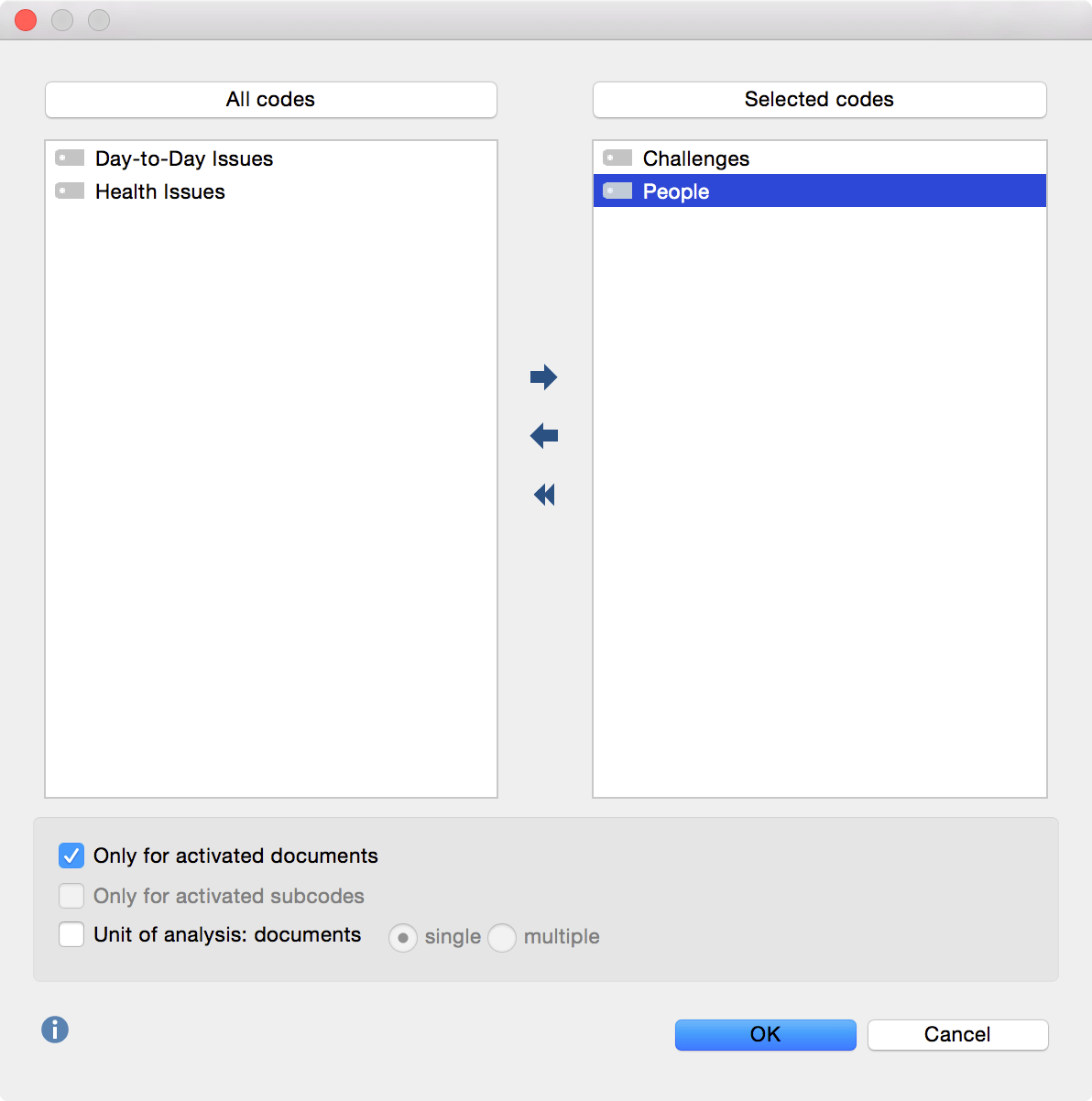
A dialog window opens. On the left side, all variables/codes with subcodes are listed; on the right side selected variables/codes appear. By clicking the arrow button you may transfer variables from one window to the other.
Once you click OK, a frequency table appears. The first column of the table lists the different subcodes of the table; the second column, the absolute frequency; the third column, the corresponding percentages. By clicking on the column header you may sort the table rows.
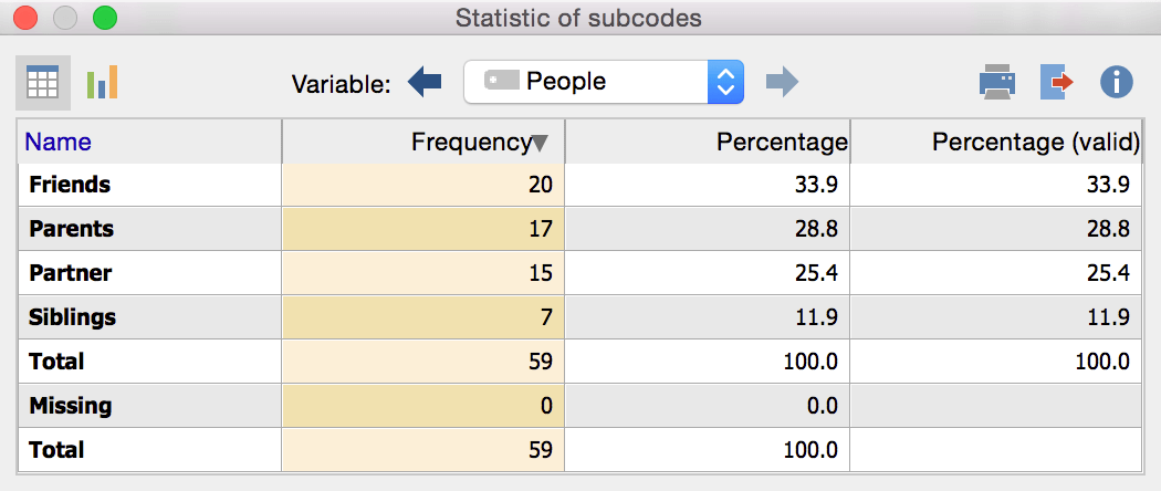
Clicking the blue arrows allows you to switch between all variables/codes you selected in step 1. Click the Chart view icon ![]() at the top left corner of the frequency table to view a visual representation of the statistic instead.
at the top left corner of the frequency table to view a visual representation of the statistic instead.
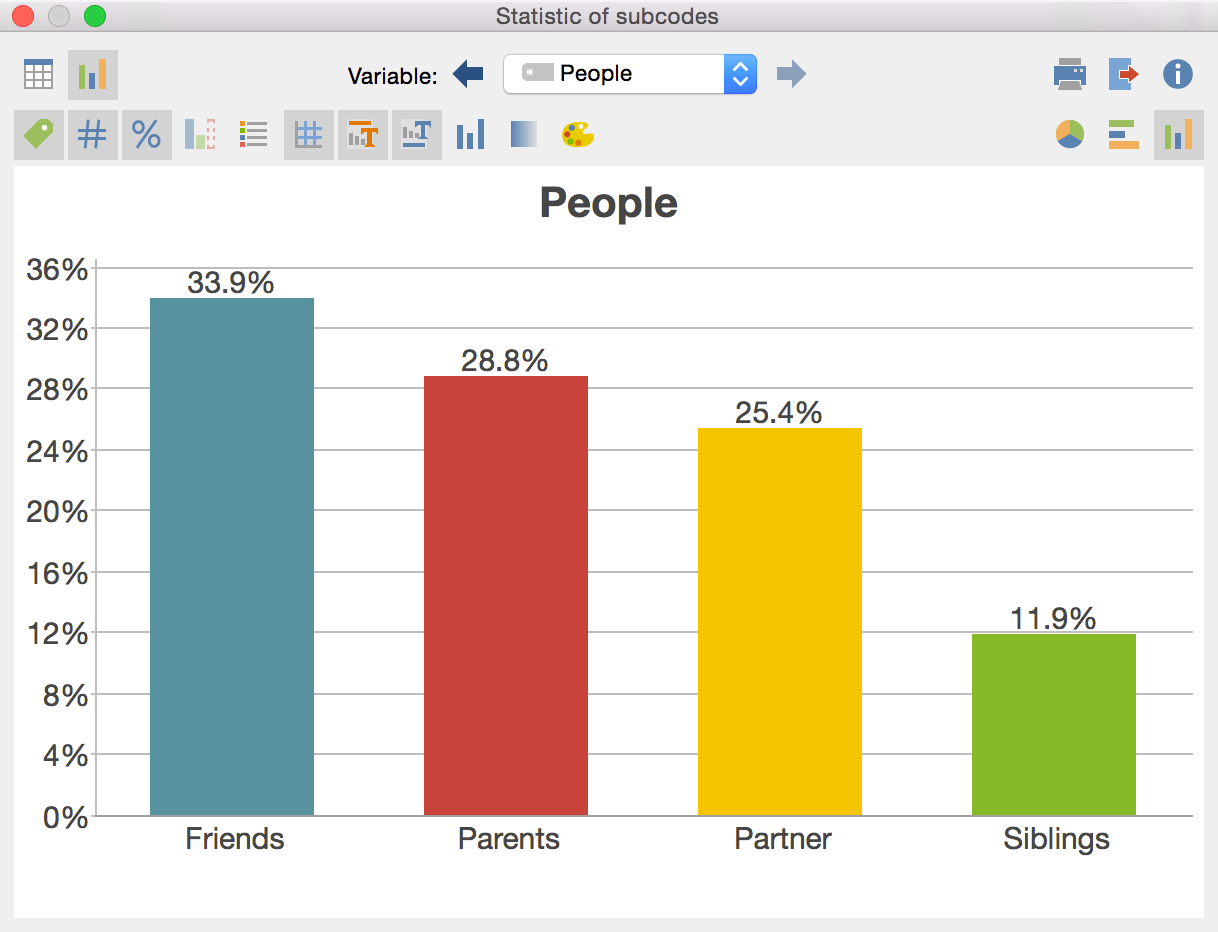
The chart view visualizes the distribution of the selected variables as a bar chart or pie chart. As you can see the diagram can be adjusted to include or hide title, legend, scale, etc. You can also pick which colors, font and font size to use before you export the diagram as an image to be used in reports and presentations.