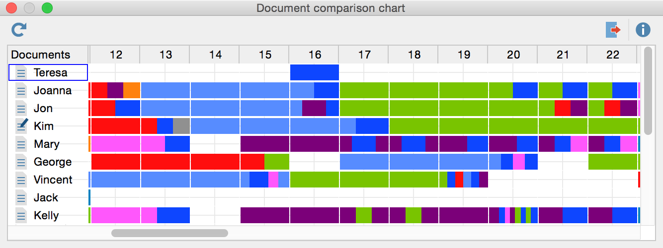
This visualization works for a number of documents at one time and offers a sort of mix between the Document Portrait and the Codeline. Simply choose the documents and codes that you wish to include in the visualization by activating them before calling up the function.
The Document Comparison Chart shows the documents on the y-axis and the paragraph numbers on the x-axis, making it possible to compare the flow of codes in each document. The cells show the codes that exist in each paragraph of each document with a bar assigned the same color as the code it represents. Each code that is present in the paragraph is represented by a colored section of the bar. If a code is used more than once in a paragraph, it is still only visualized once. To give you an idea how this works, see the screenshot below. In this example, you can see 10 paragraphs for three different documents. You can see that there were no coded segments in any of the documents in the first paragraph. In “Doc 1,” the first coded segments are in paragraph two, where two blue and one red code are visualized.
| 1 | 2 | 3 | 4 | 5 | 6 | 7 | 8 | 9 | 10 | |
|---|---|---|---|---|---|---|---|---|---|---|
| Text 1 | ■ ■ ■ | ■ ■ | ■ | ■ | ■ ■ | ■ | ||||
| Text 2 | ■ | ■ | ■ | ■ ■ | ■ | |||||
| Text 3 | ■ | ■ | ■ | ■ | ■ |
If several codes with different colors appear in the same paragraph, the space available will be shared between the codes. Generally, the space is fixed to 50 pixels. These pixels will be allocated according to the size of the coded segments. If exactly the same segment is coded with a green and a red code, then 25 pixels will be colored red and 25 green.
Like in Document Portrait, codes and colors must correspond in a meaningful way. Otherwise the diagram will have no meaning for you.
You can call up the Document Comparison Chart:
- by selecting Document Comparison Chart from the Visual tools drop-down menu, or
- by clicking on the
 symbol in the “Visual tools” toolbar.
The visualization looks like this:

The Document Comparison Chart is particularly useful for the analysis of structured documents. In this case, all the documents have the same number of paragraphs and allow for a direct comparison. You are more or less looking at a Document Portrait for each selected document at the same time.
Active Symbols
As in all visualizations, the symbols representing the coded segments are active, meaning you can jump directly to the coded segments in the original document in the “Document Browser” by double-clicking on the symbol.
Exporting the Document Comparison Chart as an Image File
The Export ![]() symbol allows you to export the current display of the Document Comparison Chart so you can later insert it into a word processing file or Powerpoint slide.
symbol allows you to export the current display of the Document Comparison Chart so you can later insert it into a word processing file or Powerpoint slide.
