Correlation analysis is used to examine relationships between variables, in particular the analysis of “the more, the more”- and “the more, the less”-correlations. MAXQDA Stats supports the calculation of bivariate correlations, thus the correlation between two variables.
In order to calculate a correlation with MAXQDA Stats, select one of the following items in the main menu:
- Correlation > Pearson, usually used for interval scale variables or
- Correlation > Spearman, usually used for ordinal scale variables
A dialog box appears that allows you to select each variable for which you wish to calculate bivariate correlations.
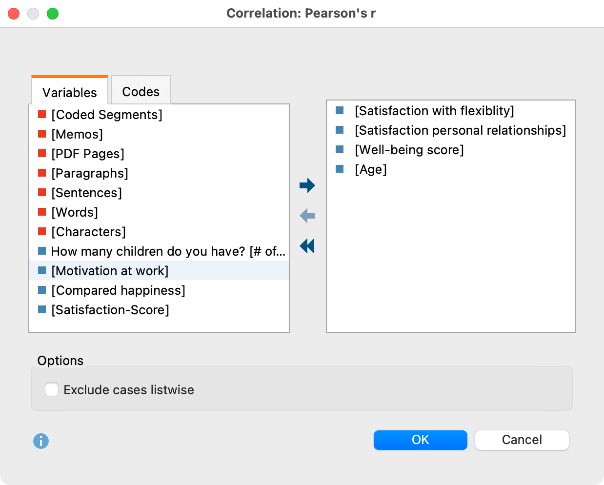
Variables can be selected in several ways:
- Double-click on a variable.
- Drag and drop the variable into the right window pane.
- Select one or multiple variables with the mouse by holding the Ctrl/Cmd key then dragging the selection into the right window pane with the mouse, or click the blue arrow in the middle of the window.
To integrate code frequencies per document into the computation of correlations, switch to the “Codes” tab and select the desired codes. (This option is available only if MAXQDA Stats was launched with the data of a MAXQDA project).
Results table
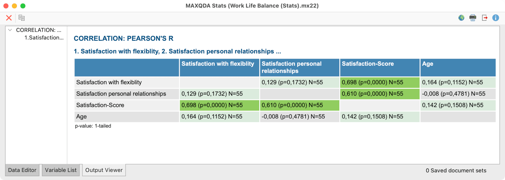
After clicking OK a results table appears containing the pairwise correlations. Since all selected variables are listed in rows and in columns all the calculated correlations are displayed twice.

Three kinds of data can be displayed in each cell:
- The calculated correlation coefficient, either Pearson’s r or Spearman’s Rho, depending on the selected function,
- the p-value for the correlation coefficient’s significance, as well as
- the number of valid cases for each combination of both variables.
The one-sided p-value is displayed by default. Using the drop down menu in the toolbar it is possible to switch to two-sided p-values. The p-value is calculated if more than 4 cases have been analyzed. If there are less cases the p-value is always 1.
Highlighting of high correlation coefficients and significant correlations
In the drop-down list in the toolbar, you can set whether high correlation coefficients, significant correlations, or no cells should be highlighted.
The higher the correlation coefficient the darker the background colors:
- larger than 0.1: light green
- larger than 0.3: green
- larger than 0.5: dark green
The smaller the p-value the darker the background colors:
- smaller than 5%: light green
- smaller than 1%: green
- smaller than 0,1%: dark green
Overview of toolbar functions
The toolbar in the upper section of the results window allows access to other important functions:
![]() Table view/Chart view – switches between the result table and scatter plots.
Table view/Chart view – switches between the result table and scatter plots.
![]() Refresh – Recalls the dialog for selection of variables for the correlation table.
Refresh – Recalls the dialog for selection of variables for the correlation table.
![]() Insert into output viewer – inserts the currently displayed table or chart in the Output Viewer.
Insert into output viewer – inserts the currently displayed table or chart in the Output Viewer.
![]() Send to QTT Worksheet - inserts the current view into a new or an existing QTT worksheet.
Send to QTT Worksheet - inserts the current view into a new or an existing QTT worksheet.
![]() Copy – copies the current table, highlighted area in the table, or chart, for example for insertion into Word.
Copy – copies the current table, highlighted area in the table, or chart, for example for insertion into Word.
![]() Print – prints the currently displayed table or chart.
Print – prints the currently displayed table or chart.
![]() Export – exports the currently displayed table in Excel format, website (HTML) format or RTF format for Word and other word processing programs; exports the currently displayed chart in PNG, SVG or EMF (only Windows) format.
Export – exports the currently displayed table in Excel format, website (HTML) format or RTF format for Word and other word processing programs; exports the currently displayed chart in PNG, SVG or EMF (only Windows) format.
![]() Undo changes – step-by-step resetting of changes to a table (deletion of rows).
Undo changes – step-by-step resetting of changes to a table (deletion of rows).
![]() Redo – step-by-step restoring of changes to a table.
Redo – step-by-step restoring of changes to a table.
Sort tables and customize columns
Tables can be sorted by clicking a column header, in ascending order with the first click and descending order with the second. Clicking again will restore the original order.
Column widths can be adjusted with the mouse, and their position can be changed by clicking the column header then dragging them to the desired location with the mouse.
Delete rows and columns
The results table is interactive and one or more rows can be removed. Right-click a row and select Delete. You can also select multiple rows to delete by holding down the Ctrl/cmd key. Right-click a column heading and select Delete to remove it from the results table.
Deleting a column or row in a correlation table only affects the display. The values are not recalculated even if selecting the option Delete cases listwise would change the number of valid values for variables taken into account.
Transfer results table to the Output Viewer
After the tables have been created, they can be transferred to the Output Viewer from which they can later be exported together:
- Click the Insert into output viewer
 icon to transfer the currently displayed results table to the Output Viewer.
MAXQDA Stats will ask if you also wish to include a descriptive statistic for the factor groups. If you agree, an additional table will be displayed below the results table.
Transfer results to Questions – Themes – Theories
In the Questions – Themes – Theories window, you can collect and comment on all the important results of your project. Click the ![]() Send to QTT Worksheet icon in the upper right corner to save the current view in a new or existing worksheet.
Send to QTT Worksheet icon in the upper right corner to save the current view in a new or existing worksheet.
Once you close MAXQDA Stats, you can access all your QTT worksheets via Analysis > Questions – Themes – Theories.
Export and print results table
Several options for exporting and printing the results table are available using the following symbols:
![]() Copy – copies the entire table or selection to the clipboard, for example in order to paste it directly into Word.
Copy – copies the entire table or selection to the clipboard, for example in order to paste it directly into Word.
![]() Print – starts the print process and displays a print preview, in which the settings such as margins, orientation, headers and footers can be applied.
Print – starts the print process and displays a print preview, in which the settings such as margins, orientation, headers and footers can be applied.
![]() Export – exports the table in Excel format, website (HTML) format or RTF format for Word and other word processing programs.
Export – exports the table in Excel format, website (HTML) format or RTF format for Word and other word processing programs.
Displaying scatter plots
In order to display a scatter plot for every pairwise combination of variables click on the ![]() Chart view symbol in the results table.
Chart view symbol in the results table.
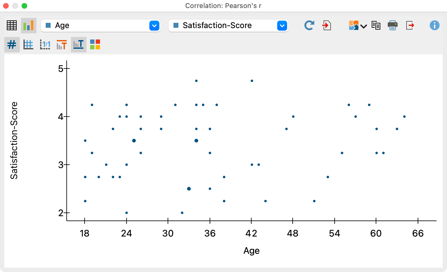
Using the two drop down menus in the top toolbar you can determine the variables for the X-axis and the Y-axis. The drop down menus contain all the variables that are selected for the calculation of correlation.

It is not possible to customize the display of the chart. The chart’s size automatically adjusts to the window size. Enlarge the window in order to display a larger chart.
The charts can be transferred to the Output Viewer for storage and later export, or they can be transferred to a QTT worksheet. To do this, click on the corresponding icons in the top right corner of the toolbar:
![]() Insert into Output Viewer and
Insert into Output Viewer and ![]() Send to QTT Worksheet.
Send to QTT Worksheet.
To export or print a chart directly, you can use the usual icons in the top right of the window:
![]() Copy,
Copy, ![]() Print and
Print and ![]() Export.
Export.
Interactivity in scatter plots
The plotted points in the scatter plot are interactively connected to the data, which is especially useful for mixed-methods analyses: Place the mouse pointer over a dot to see the associated document names when analyzing data from MAXQDA projects. Behind the document name, you will see the values that belong to this point, i.e. the coordinates in the plot:
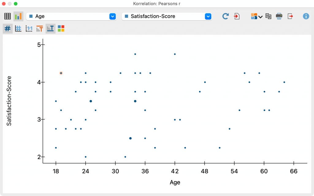
Right-click on a dot to open the following context menu:
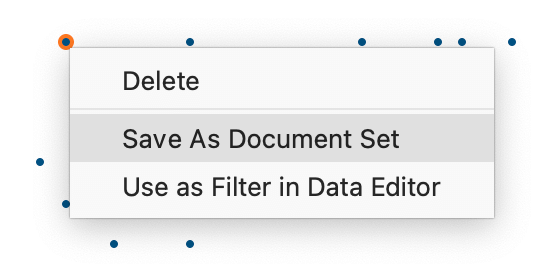
Three functions are available in the context menu:
- Delete – the selected dot will be removed from the scatter plot.
- Save as Document Set – a document set with the selected dot is saved, which is transferred to the "Document System" of the MAXQDA project when you quit MAXQDA Stats (the function is only visible if you are working with the data of a MAXQDA project in Stats).
For more information on the principle of the Save as Document Set function, please refer to the chapter Analyze Variables and Codes from a MAXQDA Project. - Use as Filter in Data Editor – a new variable "StatsFilter" is created and the filter in the data editor is switched on for this variable, so that only the values of this case are visible in the data editor. For more information about the filter function in the Data Editor, see the chapter The Data Editor.

