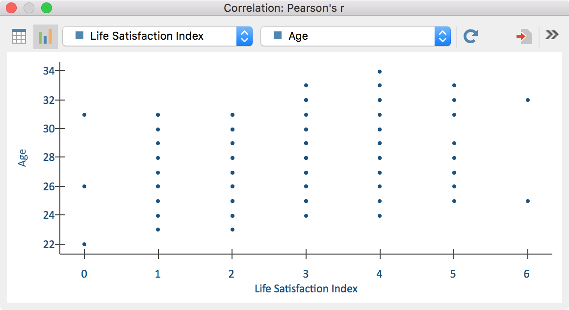
In order to display a scatter plot for every pairwise combination of variables click on the ![]() Chart view symbol in the results table.
Chart view symbol in the results table.

Using the two drop down menus in the top toolbar you can determine the variables for the X-axis and the Y-axis. The drop down menus contain all the variables that are selected for the calculation of correlation.
It is not possible to customize the display of the chart. The chart’s size automatically adjusts to the window size. Enlarge the window in order to display a larger chart.
Scatter plots can be transferred to the Output Viewer for later export. In order to do so, use the following icons.
![]() Insert chart into output viewer, to insert only the current display
Insert chart into output viewer, to insert only the current display
![]() Insert all charts into output viewer, to insert mean charts for all created result tables at the same time.
Insert all charts into output viewer, to insert mean charts for all created result tables at the same time.
To export or print a chart directly, you can use the usual icons in the top right of the window:
![]() Copy to clipboard,
Copy to clipboard, ![]() Print and
Print and ![]() Export.
Export.
