Guest Post by Lukas Maximilian Müller.
While my last two fieldwork diary entries addressed the main method used in my research – causal process tracing – this one will discuss how MAXQDA is not only helpful in carrying out data analysis, but also a very useful tool for the refinement of ongoing research and the presentation of results to the public, as well as supervisors and reviewers.
I will tell you about how MAXQDA supported me in the refinement of my research, helping me identify gaps in my empirical data and providing a solid background for the design of follow-up questionnaires. In addition to this, MAXQDA was also helpful in visualizing data output.
When concluding a research project, it is important to strongly convey its key findings; it is often easier to get your point across with the right visualization. MAXQDA can be immensely helpful in the visualization of data output, providing several powerful options to make your data easier to understand and more actionable for policymakers. If we are to be serious about conducting research for change, we need to consider how we can convey the outputs of our research in a practical way.
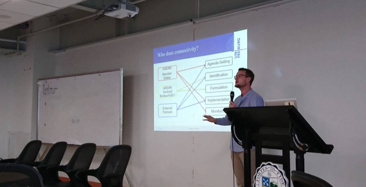
Picture 1: Lukas presenting research outcomes at a conference
Refining Research – How MAXQDA can help to identify gaps and find solutions
Haven’t we all been there? You have a dataset, you have some research hypotheses, but whichever way you try, you cannot quite make them fit. This is also what happened to me at one point during my research. One of my main research questions related to the policy-influence of central regional institutions in West Africa (ECOWAS) and Southeast Asia (ASEAN). What I wanted to find out was whether these organizations were involved in one or more of the stages of regional policy making, namely: agenda setting, identification, formulation, implementation or monitoring. The policy cycle is a fairly straightforward and commonly applied heuristic in political science research and I expected few surprises during my research.
But what would research be if it always went the way we wanted it to go?
I took my straightforward research question into the field and – no surprises there – got some useful answers regarding the involvement of the two organizations in the policy cycle. Most interviewees gave me straightforward answers: they were either involved in agenda setting, identification, formulation, implementation or monitoring. But when I started to transcribe and code my data back in the comfort of my office, I realized that a pesky residual category always remained: Other.
What now? Fortunately, I was lucky enough to get a second chance to talk to some of my interviewees. If this is a possibility, MAXQDA can make it very easy to refine follow-up questionnaires, both in general as well as specifically focusing on certain interviewees.
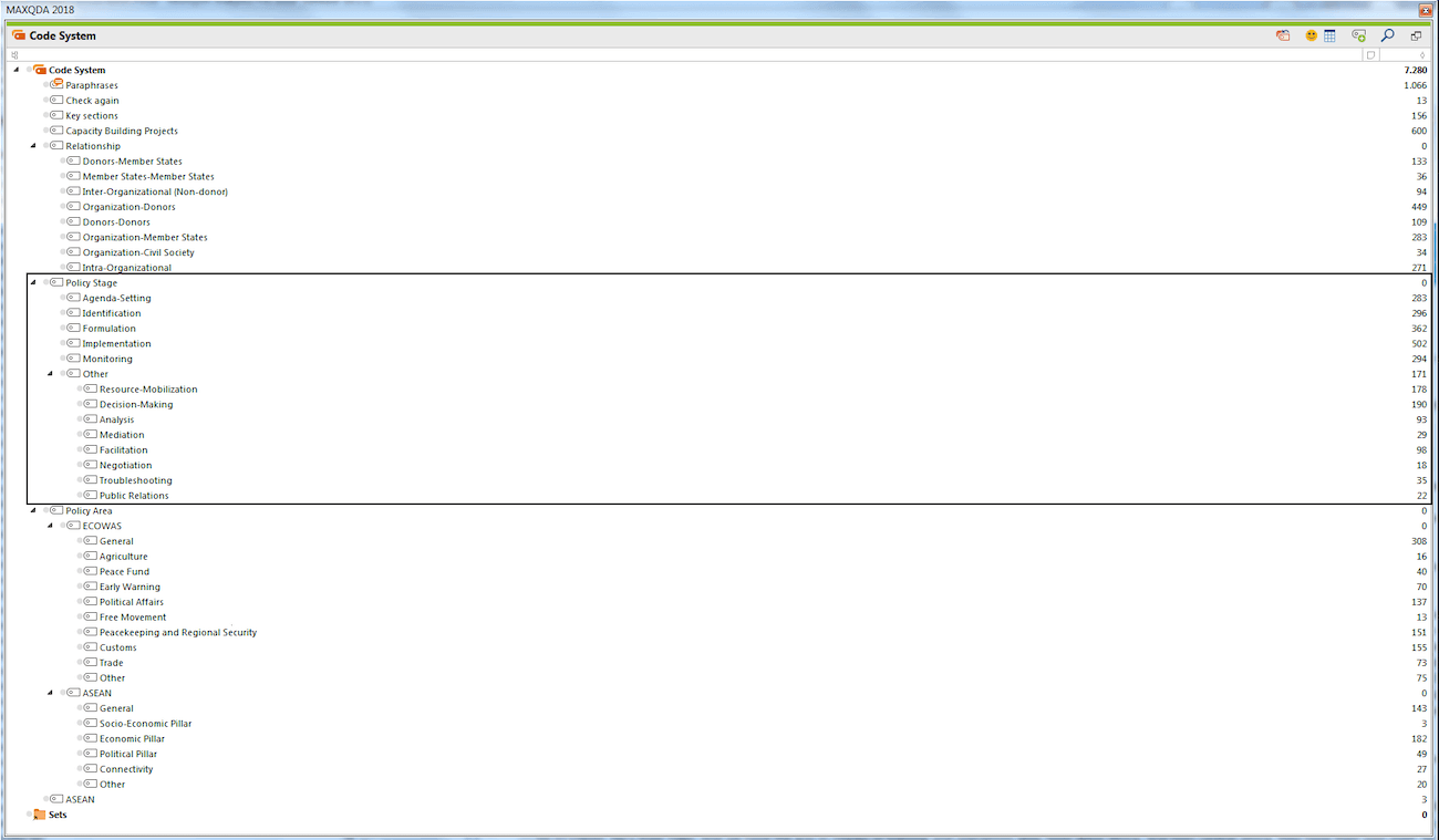
Picture 2: Complete Code Tree in MAXQDA’s “Code System” window
In picture 2, you can see my complete code tree in MAXQDA’s “Code System” window. There are a lot of things we can do with a dataset encompassing over 7000 coded segments, but the most important thing to ensure, before moving on to other modes of analysis, is that our dataset is as conceptually sharp as possible, which is why we need to eliminate this pesky “other” category. Within the policy stage category, you can see the five initial coding categories, as well as the “other” category and its sub-codes, which I created inductively. You can already see that some of them have occurred more frequently than others. What is important at this stage is to assess which ones of them deserve a closer look in follow-up interviews.
Two questions emerge for the next stage of interviews:
- Which other policy stages are worth assessing in detail?
- Which interviewees do we have to follow up with to find out more about the different policy stages?
Fortunately, MAXQDA has a function that can answer both questions at once: The Code Matrix Browser. In Picture 3, you can see the incidence rate of coded segments relating to the different policy stages in general (black rectangle) and the other category and its subcodes in particular (red rectangle).
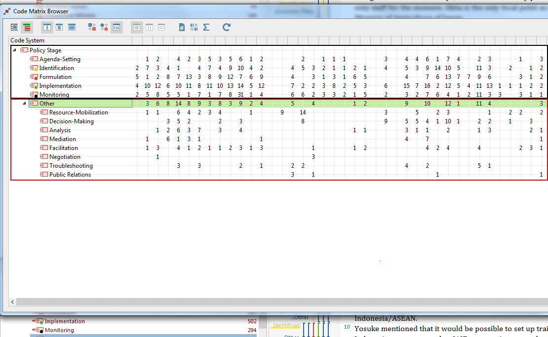
Picture 3: Incidence rate of coded segments using MAXQDA’s Code Matrix Browser
MAXQDA’s Code Matrix Browser has several additional setting options that make our job easier: we can set the width of the columns to ‘narrow’, allowing us to look at more documents at the same time. We can also visualize the frequency of the codes as numbers, giving us a direct view of how many code assignments there are in each document for each code. The visualization can also be set to squares or circles if you want to present your data for an audience that is not interested in the precise number of coded segments.
Now, what does the data tell us?
First of all, we can see in Picture 3, which documents the “other” category popped up in most frequently (see the numbers in the green row), which gives us some indication of which interviewees we should probably follow up with – those people mostly talking about policy stages that fall outside of our initial theoretical model.
But what should we ask these people about? To answer this question, it is useful to look at the columns below (the subcodes within the red rectangle), which give us the frequency of the different sub-coded segments within each interview. Upon closer inspection, it seems to make the most sense to adjust our questionnaire to include the first five sub-coded segments of the “other” code: resource-mobilization, decision-making, analysis, mediation, and facilitation. Negotiation, troubleshooting, and public relations simply do not occur often enough to deserve their own question in a future questionnaire. So, based on this revision, our follow-up questionnaire will not only cover five policy stages as it did before. Instead, it will also include the five stages that we have now identified.
Knowing what we know about the specific interviewees, we can now also design specific questionnaires, focusing on particular policy stages that the interviewees have shown they like to talk about in their first interviews.
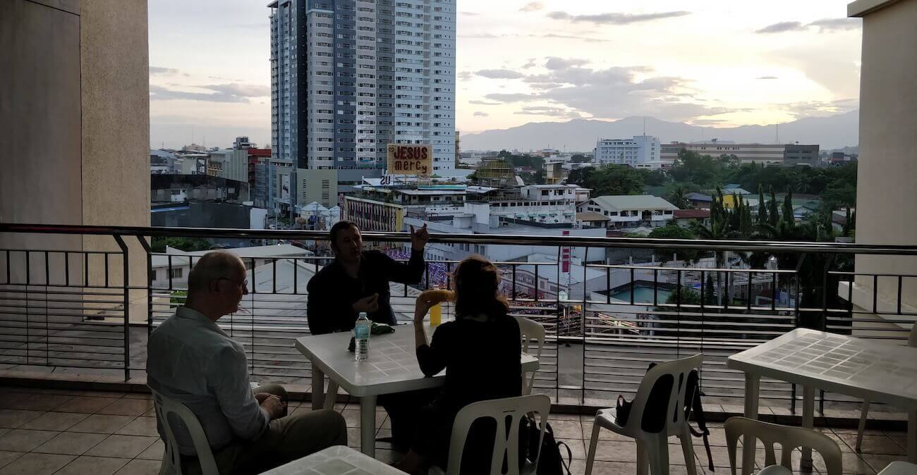
Picture 4: Colleagues discussing research findings at a conference in the Philippines
Concluding research – How to create snazzy graphics in MAXQDA
Even a PhD research project must come to an end, and at some point you start to think about how to communicate the key messages of your research to a wider audience, or maybe just to your supervisor. MAXQDA also has some powerful tools to communicate your output, through the visualization of datasets. One of the most powerful tools for this is MAXQDA’s Document Comparison Chart, which can highlight how much time interviewees spent talking about a particular category. This analysis can be used to bring home one of the main conclusions to the research question discussed above: at which policy stage are the two regional institutions most engaged?
After 170 interviews, we now know at which policy stages the ASEAN Secretariat and the ECOWAS Commission are most active. The ASEAN Secretariat is particularly active in monitoring policies, while the ECOWAS Commission plays a large role in supporting the implementation of policies in member states. And we have a lot of qualitative data to back this up. Obviously, a person could read through our whole thesis and then hopefully understand that these are the points we are trying to make. But why not make it easier for them with a nice and obvious graphic representation?
How do we make the data easier to understand?
Using the Document Comparison Chart, we can visualize these two main points quite easily. By highlighting how much time our interviewees spent talking about the most significant activity of their respective organization.
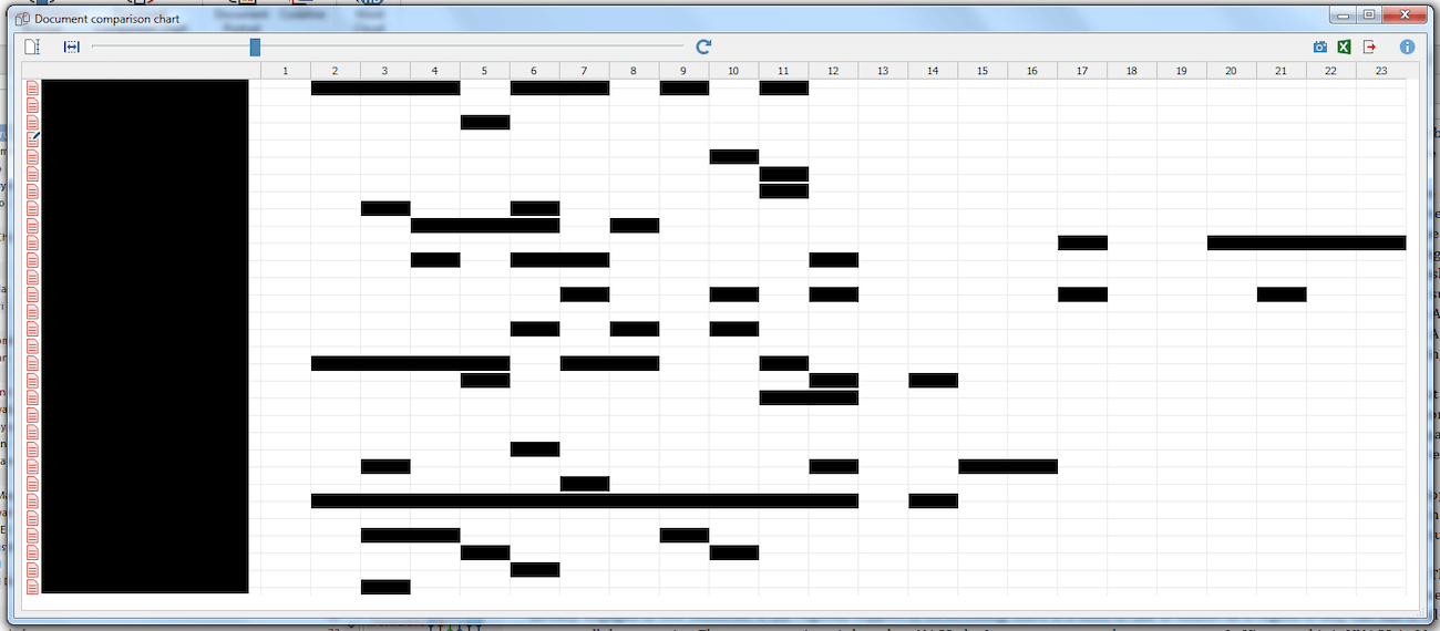
Picture 5: Interview comparison using MAXQDA’s Document Comparison Chart
In Picture 5, you can see how much time ASEAN interviewees spent talking about monitoring, compared to the total time spent talking. That’s quite a lot of time spent talking about one single policy stage. And it is, in fact, the policy stage where the organization is most active and influential. This is easier to understand once a reader has this graphic in front of him or her.
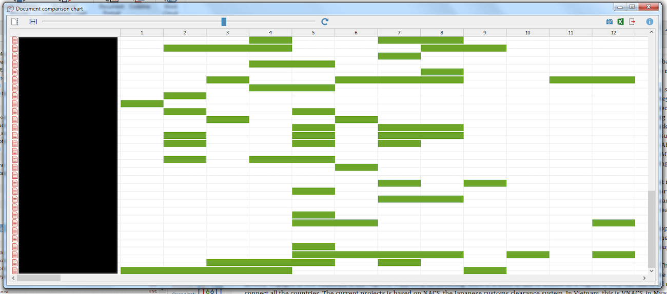
Picture 6: 2nd Document Comparison Chart using MAXQDA
Likewise, in Picture 6, we see how much time was spent by (some) ECOWAS interviewees talking about their policy implementation activities. Another useful thing to know about the Document Comparison Chart is that we can easily adjust the scale of the chart by leveling differences in document size. In Picture 5, the documents all had up to 23 paragraphs (see top row in grey). In Picture 6, the documents only had up to 12 paragraphs. The Document Comparison Chart allows us to adjust the two different sizes of the documents with one single slide, making the documents more easily comparable and less confusing to the reader.
The next step – How MAXQDA can be used to kick-start new projects
Even though projects eventually end, researchers are always on the lookout for new projects. MAXQDA can also be helpful in identifying new research gaps in documents or highlighting features of datasets not yet investigated. Now, close to the end of my research project, I am in the process of looking at further avenues of research.
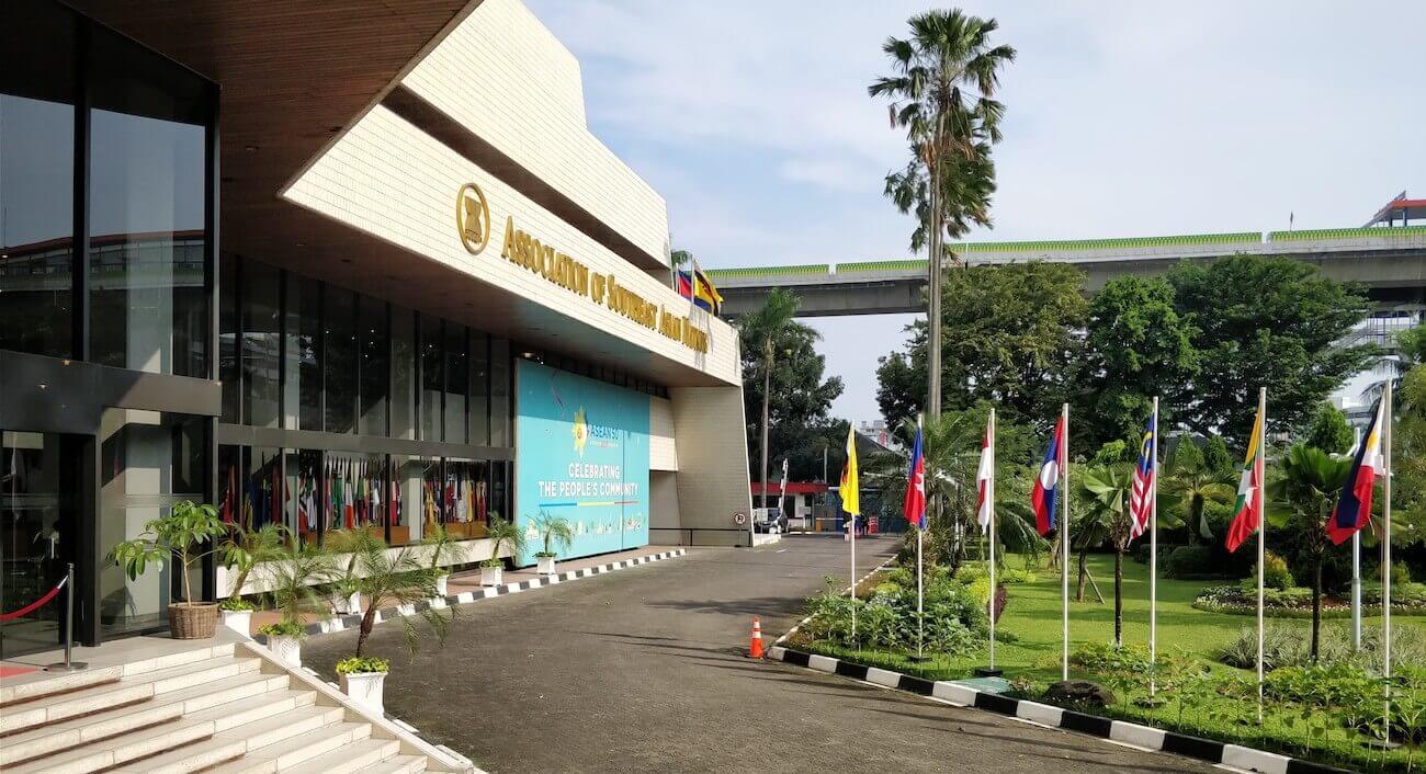
Picture 7: The ASEAN Secretariat Building
One thing I can say is that the same techniques I just presented for refining and presenting research are just as appropriate when outlining research gaps and applying for grant funding. In fact, highlighting puzzles within a dataset can be a very convincing argument to launch a future research project. For this reason, MAXQDA is not just the middle and end point of a successful research project, but can also act as a starting point for research.
Editor’s Note
Lukas Müller is a recipient of MAXQDA’s #ResearchforChange Grant. He is a PhD student in Political Science at the Albert-Ludwigs-Universität Freiburg (University of Freiburg), Germany. His research project titled, “Whose Policy? The Policy Processes of the ECOWAS Commission and the ASEAN Secretariat and the Impact of External Capacity Building” is a comparative case study analysis across two continents. Müller is currently analyzing his research data after having just finished the fieldwork phases of his project which took place in Abuja, Nigeria, and Jakarta, Indonesia. This is his final fieldwork diary. We wish Lukas Müller all the very best on his ongoing research journey!