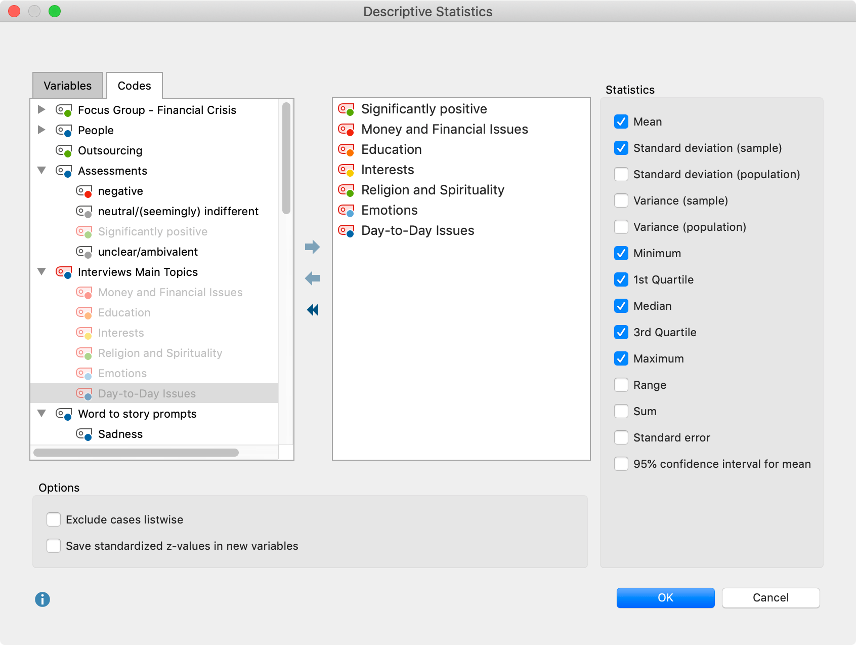
With MAXQDA Stats you can calculate various measures of descriptive statistics for several variables simultaneously, and compare results in an easy-to-read table. Begin the evaluation using the Descriptive Statistic > Descriptive Statistics menu. The following window will appear, where you can select all the desired variables and codes. In the window, only integer or floating point variables will be displayed:

Variables can be selected in several ways:
- Double-click on a variable.
- Drag and drop the variable into the right window pane.
- Select one or multiple variables with the mouse by holding the Ctrl/Cmd key then drag the selection into the right window pane with the mouse, or click the blue arrow in the middle of the window.
To generate descriptive statistics for code frequencies per document, switch to the “Codes” tab and select the desired codes. (This option is available only if MAXQDA Stats was launched with the data of a MAXQDA project).
In the right pane of the window you can select typical metrics and values for the descriptive statistics, some of which require further explanation:
1st and 3rd Quartile – The first quartile corresponds to the 25th percentile and indicates the value below which 25 % of all values fall. Accordingly, 25% of all values are greater than the value of the third quartile, that is the 75th percentile. There are various methods to determine the percentile of a distribution of measured values. A review of nine different methods can be found in Hyndman & Fan (1996): “Sample quantiles in statistical packages”. In MAXQDA Stats method no. 7 is implemented, which is also the default method used by “r”.
Standard deviation (sample) vs. (population) – for the standard deviation of population the unbiased estimator is calculated by dividing the sum of squares by (n - 1), while selecting “sample” the sum is divided by n. The same applies to the calculation of the variance.
Mean error – the standard error of the mean value is output, which is estimated from the random sample. When several samples are taken from a population, the means of these samples scatter around the true mean of the population. This scattering is called mean error.
95% confidence interval for mean – Using the mean error, the limits of the interval are calculated and displayed, which represent a 95% probability of the population mean.
In the lower section of the window, the following options are available:
Exclude cases listwise – select this option to include only cases for which all selected variables have a valid value.
Save standardized z-values in new variables – Check this option to perform a z-standardization of values for all selected variables and codes, and store the results in the new variables. The original variable name is used, supplemented by the suffix "_zvalues”. Existing variable labels are also used and supplemented by the suffix (z-standardized). If no variable label was present, the variable name is entered as a label.
Results tables
After beginning the evaluation by clicking OK the following results table appears, in which the selected variables and codes form the rows and the selected measures form the columns:
The result table always contains the column “N” with the number of valid cases (far left) and the column “Missing” and “Missing (%)” (far right), which provide information on the absolute and relative proportion of missing values for each variable. When the “Exclude cases listwise” option is selected, the missing values are all identical. In the example above, code frequencies were evaluated, among which there were no defined missing values, therefore the last two columns contain null values.
Sort Tables and Customize Columns
Tables can be sorted by clicking a column header, in ascending order with the first click and descending order with the second. Clicking again will restore the original order.
Column widths can be adjusted with the mouse, and their position can be changed by clicking the column header then dragging them to the desired location with the mouse.
Delete Rows (Variables)
The results table is interactive and one or more rows (variables) can be removed. Right-click a row and select Delete. You can also select multiple rows to delete by holding down the Ctrl/cmd key. When a variable is deleted from the table the table will not be recalculated, even if the Exclude cases listwise option was selected and the number of the valid values would change.
Transfer results table to the Output Viewer
Once the tables have been created and adapted according to your needs, they can be transferred to the Output Viewer by clicking the Insert into Output Viewer ![]() icon, which allows the tables to later be exported along with other results.
icon, which allows the tables to later be exported along with other results.

Export and print results table
Several options for exporting and printing the currently displayed results table are available using the following symbols:
![]() Copy to clipboard – copies the entire table or selection to the clipboard, for example in order to paste it directly into Word.
Copy to clipboard – copies the entire table or selection to the clipboard, for example in order to paste it directly into Word.
![]() Print – starts the print process and displays a print preview, in which the settings such as margins, orientation, headers and footers can be applied.
Print – starts the print process and displays a print preview, in which the settings such as margins, orientation, headers and footers can be applied.
![]() Export – exports the table in Excel format, website (HTML) format or RTF format for Word and other word processing programs.
Export – exports the table in Excel format, website (HTML) format or RTF format for Word and other word processing programs.
Display results as a box plot or histogram
You can display the distribution of an evaluated variable or code as a box plot or histogram. Using the symbols ![]() and
and ![]() you can switch between the chart view and the table view. As soon as the chart is visible, you can choose between box plot and histogram.
you can switch between the chart view and the table view. As soon as the chart is visible, you can choose between box plot and histogram.

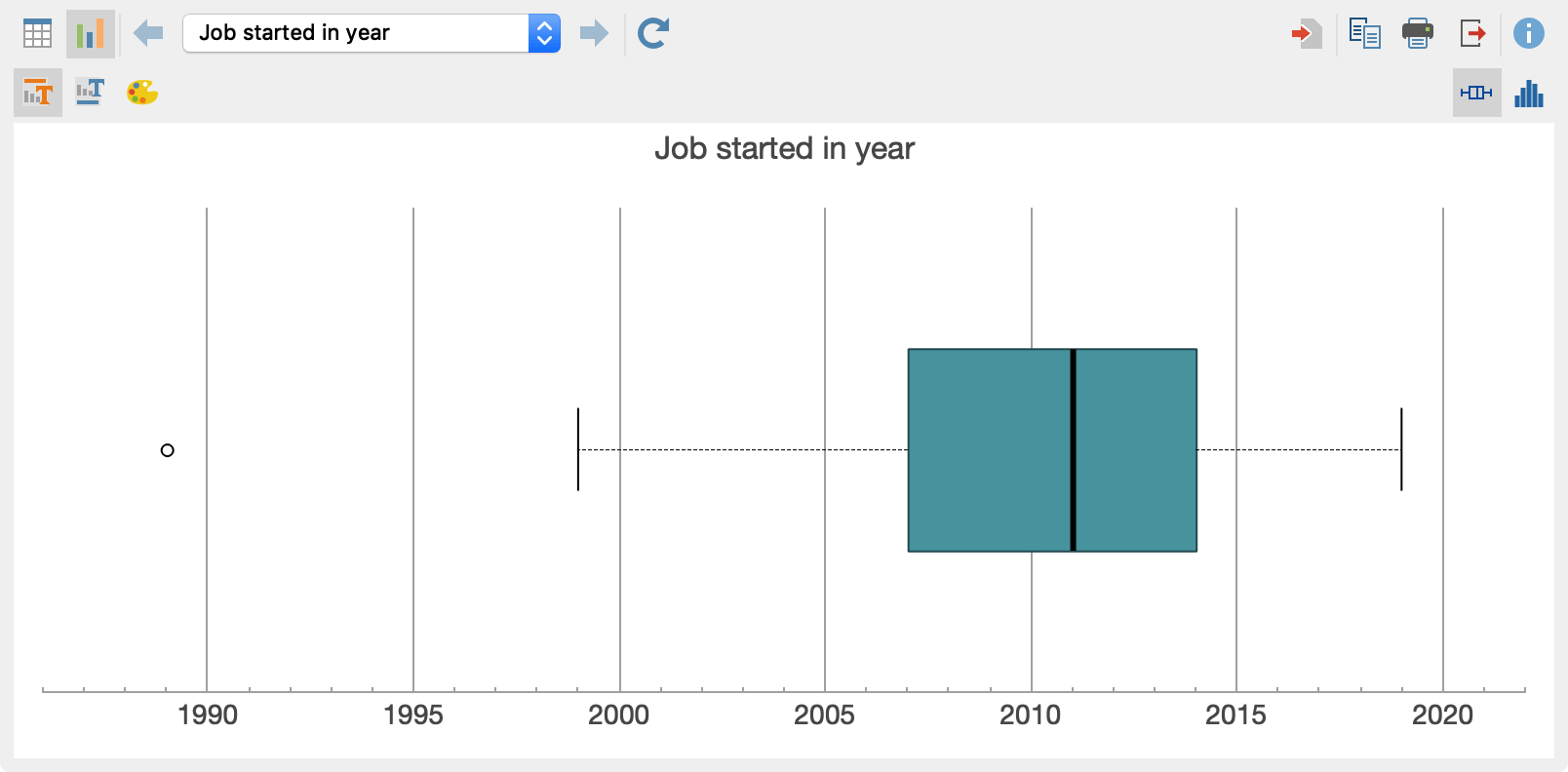
The box plot is generated according to the following rules:
- The vertical line in the box indicates the median.
- The boundaries of the box correspond to the 1st and 3rd quartiles.
- The arms ("whiskers") reach up to the highest or lowest data value, which is a maximum of 1.5 interquartile distances from the edges of the box.
- All data outside the whiskers are marked with a circle as an outlier.
You can change the display from a ![]() box plot to a
box plot to a ![]() histogram by clicking on the corresponding icons in the upper right hand corner:
histogram by clicking on the corresponding icons in the upper right hand corner:

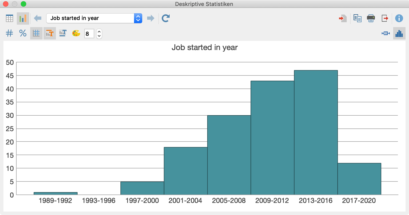
MAXQDA calculates the initial number of classes used according to the Rice Rule: Round up (2n^(1/3)). For integer variables, empty classes may not be displayed at the end of the distribution. You can adjust the number of classes for the currently displayed histogram at any time in the number field above the chart.
You can use the icons in the toolbar above the chart to display or hide titles and subtitles and to set the color. With histograms, the data label above the columns can also be switched on and changed from absolute to relative values.
The size of the diagram automatically adjusts to the window size. Enlarge the window to obtain a larger diagram.
Exporting charts
Box plots and histograms can be transferred to the output viewer and stored for later export. To do this, click on the icons
![]() Insert chart into output viewer, to transfer only the current view, or
Insert chart into output viewer, to transfer only the current view, or
![]() Insert all charts into output viewer to insert the diagrams of allanalyzed variables and codes at once.
Insert all charts into output viewer to insert the diagrams of allanalyzed variables and codes at once.
To export or print a chart directly, the usual symbols are available in the upper right-hand corner of the window:
![]() Copy to clipboard,
Copy to clipboard, ![]() Print,
Print, ![]() Export.
Export.
