Great design in professional tools isn’t just about aesthetics—it’s about understanding how people think, work, and solve problems. Through this philosophy we’ve been awarded the German Design Award in the category “Excellent Communications Design – Interactive User Experience,” a recognition that celebrates exceptional interface design and user-centered innovation. We spoke with Julia Gerson (Chief Product Officer) and Keyvan Fartoute (Lead Designer) about what it takes to redesign a professional research tool that has been evolving for decades, and why putting users at the center of every decision made all the difference.
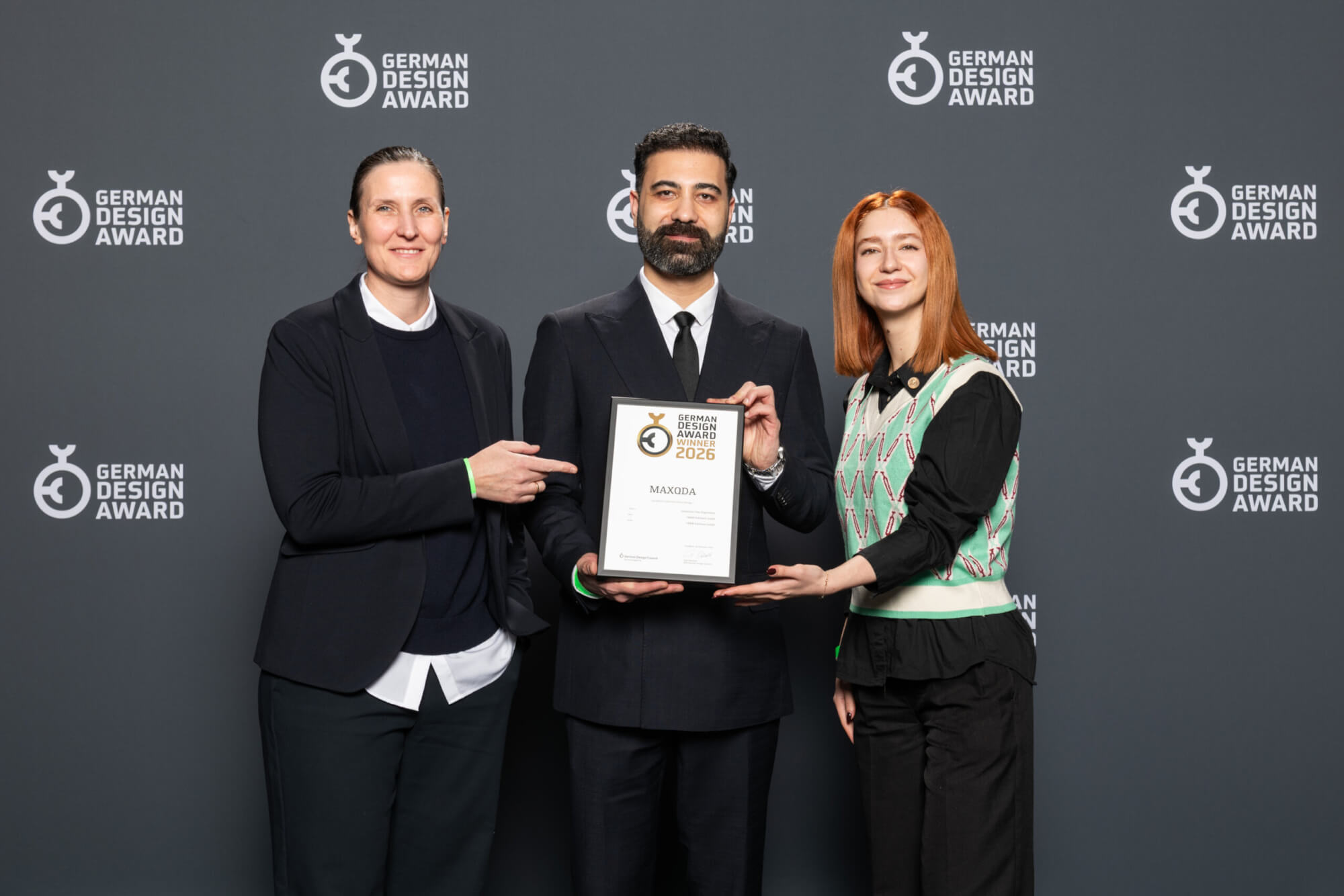
German Design Award Ceremony, Frankfurt am Main, 10.02.2026 with Julia (CPO), Keyvan (Lead Designer), and Niloufar (UI Designer)
The Jury’s Statement: A thoughtfully conceived interface unites clarity, depth and flexibility into a powerful user experience in »MAXQDA«. The confident design, nuanced visualizations and integration of AI-powered features create a harmonious yet distinctive workspace. This project impresses with its striking relevance for researchers and stands out at Gold level through its expressive, strategic interactivity.
What was the main vision behind the MAXQDA interface design?
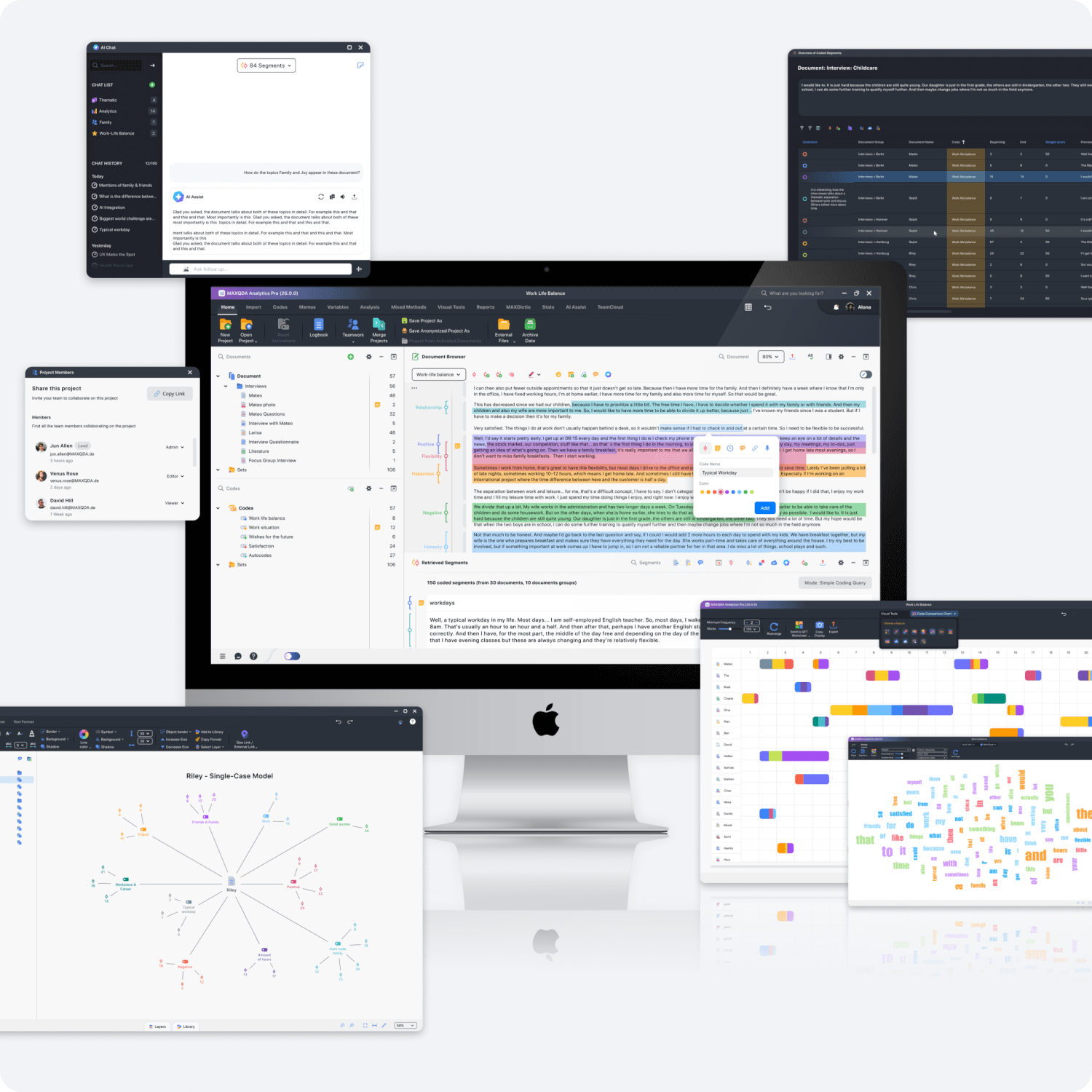
Julia: In 2023, we decided to invest heavily in improving MAXQDA’s design. The core structure dates back to the 1990s – and still works remarkably well! The four-window layout, in particular, remains central today.
But over time, the software had grown significantly. New features kept being added, and the interface—especially the toolbars—became crowded. Too many icons competed for attention. The visual style and interaction patterns also needed an update. We didn’t want to reinvent everything. The goal was to let the existing structure breathe and make complex features easier to access.
Keyvan: The vision was simple: reduce complexity without reducing power. MAXQDA is incredibly powerful and capable. But over time that capability had created visual density. My goal was to bring clarity back into the experience.
With nearly ten years in UX/UI design, I’ve learned that good design isn’t about adding more it’s about making thoughtful decisions about what to simplify, what to highlight, and what to remove. In MAXQDA, that meant improving hierarchy, creating a consistent visual language, and making sure every element on screen has a clear purpose to be there.
We wanted the interface to feel calm and structured even when the research itself is complex and intellectually demanding.
What specific challenges arise when designing a QDA software?
Julia: One major challenge is the number of possible interactions. Almost every element in MAXQDA supports multiple actions. A simple right-click, e.g. on a document, can reveal a long list of options.
So we constantly ask: what should be visible immediately, what should be grouped, and what can stay hidden but discoverable? These decisions require a lot of discussion and testing.
Then there’s user diversity. Someone analyzing thousands of survey responses works very differently from someone conducting grounded theory interviews. A student has different expectations than a media researcher working with video. We cannot design for one “typical” user. Every decision has to work across very different workflows.
Keyvan: From a design perspective, one of the biggest challenges is responsibility. In QDA software, every interaction can affect a researcher’s project. A small design decision can influence how someone structures, interprets, or even understands their data. That makes clarity and feedback extremely important.
Another challenge is that researchers use MAXQDA for long periods of time sometimes for years. Small usability issues may seem minor at first, but over time they can become frustrating. That’s why details like spacing, interaction feedback, and workflow efficiency really matter.
We also constantly balance two very different user groups: beginners who need guidance and experts who need speed and depth. Supporting both without making the interface feel overloaded is a constant challenge.
How did you manage to combine functionality and aesthetics in a way that resulted in an award-winning interface?

German Design Award
Julia: One major challenge is the number of possible interactions. Almost every element in MAXQDA supports multiple actions. A simple right-click, e.g. on a document, can reveal a long list of options.
So we constantly ask: what should be visible immediately, what should be grouped, and what can stay hidden but discoverable? These decisions require a lot of discussion and testing.
Then there’s user diversity. Someone analyzing thousands of survey responses works very differently from someone conducting grounded theory interviews. A student has different expectations than a media researcher working with video. We cannot design for one “typical” user. Every decision has to work across very different workflows.
Keyvan: From a design perspective, one of the biggest challenges is responsibility. In QDA software, every interaction can affect a researcher’s project. A small design decision can influence how someone structures, interprets, or even understands their data. That makes clarity and feedback extremely important.
Another challenge is that researchers use MAXQDA for long periods of time sometimes for years. Small usability issues may seem minor at first, but over time they can become frustrating. That’s why details like spacing, interaction feedback, and workflow efficiency really matter.
We also constantly balance two very different user groups: beginners who need guidance and experts who need speed and depth. Supporting both without making the interface feel overloaded is a constant challenge.
How did you manage to combine functionality and aesthetics in a way that resulted in an award-winning interface?
Keyvan: For me, aesthetics and functionality are closely connected. Clear visuals improve usability. Better spacing improves orientation. Consistent icons improve recognition. Design is not decoration it directly supports how people work.
It is important to treat scientific software with the same care as any premium digital product. Researchers invest a huge amount of intellectual energy into their work. Their tools should reflect that same level of quality.
We developed our own visual language and designed our icons and components from scratch, so that we are able to align appearance and interaction from the beginning. Everything is designed with intention. That consistency is, in my opinion, what elevates the overall experience.
Julia: We always work as a team. Every change is developed by a design expert and a MAXQDA domain expert together. Both are equally committed to finding solutions that balance visual clarity, usability, and functional depth—without losing sight of our diverse user base.
Which moment in the design process was your personal key breakthrough?
Keyvan: A key moment for me was when we stopped thinking mainly in terms of screens and started thinking in terms of workflows. Especially during the introduction of AI Assist, we had to rethink how researchers move through their analysis instead of simply adding a new feature into an existing structure. This shift helped us design more holistically. It strengthened the collaboration between design and domain expertise and allowed us to focus on the bigger picture: how people actually work inside MAXQDA.
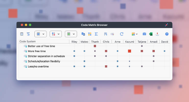
MAXQDA’s awarded interface
How did you incorporate feedback from researchers into the design?
Julia: We always work as a team. Every change is developed by a design expert and a MAXQDA domain expert together. Both are equally committed to finding solutions that balance visual clarity, usability, and functional depth—without losing sight of our diverse user base.
What does this German Design Award mean to the team and does it demonstrate that good design makes a difference in scientific software?
Keyvan: For me, the award confirms that serious design work makes a difference – even in specialized research tools. Design excellence should not be limited to consumer apps. Professional software deserves the same ambition.
Good design directly impacts focus. Every unclear interaction or unnecessary step interrupts analytical thinking. Over time, that interruption adds up. My belief is that design should become almost invisible. When researchers can fully concentrate on their analysis without thinking about the interface, design has done its job.
Julia: Great design also signals care and builds trust. It shows that a team takes responsibility for its product. Researchers often work on long-term projects. They need tools they can rely on. We want users to feel how much we care about their success.
How will this award influence your continued work on the product?
Keyvan: An award raises our standards even more. For me, it increases the responsibility to maintain and further develop the level of clarity and quality we’ve achieved. Design is an ongoing process. Every new feature has to fit into the system without creating new clutter. That’s the real challenge.
Julia: We’ll appreciate the recognition and then continue doing what we’ve always done: solving complex problems and improving MAXQDA step by step.
What are the German Design Awards?
The German Design Awards are the international premium prize of the German Design Council. With their global reach and international reputation, they are among the most respected awards in the design landscape. Since 2012, the Awards have identified key design trends, made them visible, and honored them. Each year, outstanding work in product design, communication design, and architecture is recognized. This year, MAXQDA has been awarded for our excellent Communications Design.