Last year, I read Sally Rooney’s novel Normal People and fell in love with her writing style. There is something so raw and real and relatable in the simplicity of her prose. So when her latest novel, Intermezzo released a few months later, I went into it expecting to love it, and I wasn’t mistaken. Because of my outright obsession with Normal People, I also went into Intermezzo with sharper attention to detail, annotating and tabbing my favorite sections to the point where I ran out of tabs.
Intermezzo follows two brothers, Ivan and Peter, who are navigating complicated romantic relationships while dealing with the loss of their father. Peter is trying to understand his feelings for two different women; Ivan is beginning a relationship with an older woman, Margaret. The book is divided into chapters written from Peter’s perspective and Ivan and Margaret’s perspectives.
I appreciated how Rooney’s writing made a sharp distinction between the three characters whose points of view were seen. If you saw short, stunted half-sentences, you were likely reading a chapter from Peter’s POV. The compound complex sentences, on the other hand, were more likely to be credited to Ivan. I started to wonder if I could visualize these differences in the writing. Thus, Intermezzo: The Analysis was born!
The Project
Intermezzo: The Analysis is a quantitative literary analysis of Sally Rooney’s novel. You can explore the book through mappings of character perspectives, word frequencies, and an artistic display of the sentence lengths of the entire novel.
The goal of the analysis was to compare the language of the main characters. Thus, the structure of the entire project was dependent on my sectioning the book by character point of view. Given the book’s 400+ page count, I was not planning to collect all of the data manually. This is where MAXQDA came in (along with a couple of other tools).
I stumbled upon MAXQDA when looking for tools to collect quantitative data on a text. I had not previously done work with coding and textual analysis. MAXQDA had an approachable interface, and I was intrigued by the visualization tools. It turned out to be a great choice, and helped me create visuals I hadn’t even thought of before trying it! There is still so much I have yet to explore in MAXQDA, but even the simple tools I used were tremendously helpful to me.
The Tools
Coding
I used a variety of tools when creating the data visualizations in Intermezzo: The Analysis. The most important was the coding tool. I coded the sections of the book by chapter and character POV. This helped me organize the data points I collected and gave me the structure I used in the visuals throughout the book.
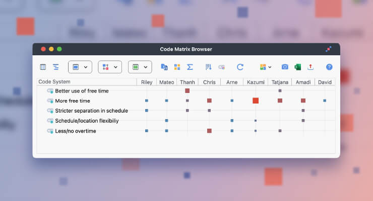
Coding in MAXQDA
Coding qualitative data lies at the heart of many analysis approaches and refers to the process of labelling phenomena in a text or image, i.e. assigning a code (a label) to a segment of your material. To create your Code System simply go to the “Codes” window and click on new code. Choose a descriptive name, select a color for easy visual identification, and add a description explaining when to apply it. The new code will then appear in the “Codes” window. To code a text segment highlight it and assign the code via drag-and-drop. MAXQDA supports a wide range of coding approaches with specialized tools, including techniques like in-vivo coding and the use of visual markers like highlighters and emoticons. For a more detailed explanation, see our Online Manual.
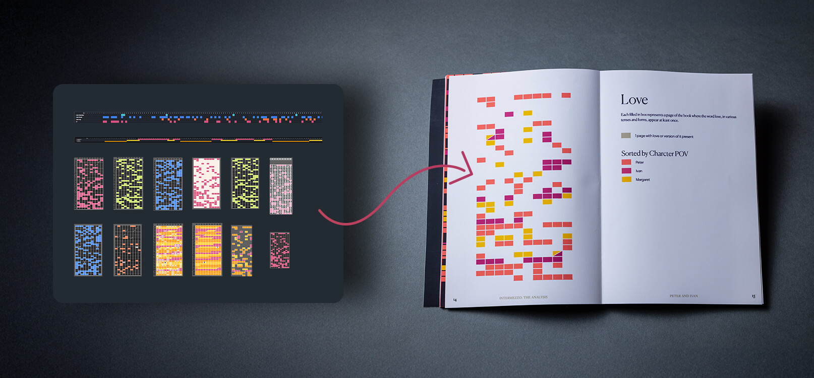
Document Portrait
The document portrait tool was also a huge part of my process. It served as inspiration for POV pages, which structure visuals seen throughout the book. After I coded the sections of the book by character POV, the document portrait tool gave me a quick visual sense of the relative size of each character’s sections. Based on this, I created the POV visuals. I liked the gridded visualization of the data in the character portrait tool, though I did edit it in Illustrator to make the boxes match up to the page count of the book (one page per box).
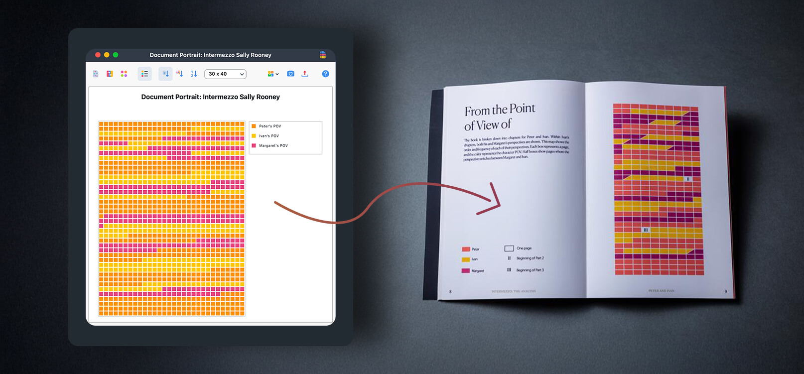
Document Portrait
The Document Portrait is one of the many Visual Tools MAXQDA has to offer. It displays the sequence of codes assigned throughout a single document, allowing you to quickly see how code occurrences change. In the example above, the Document Portrait reveals that the POV changes throughout the book but starts and ends with Peter’s POV. To get the most out of the Document Portrait, assign distinct colors to each code. This makes it easy to visually differentiate between codes. For example, using orange to represent Peter’s POV and yellow for Ivan’s POV. You can also change the display to visualise the relative portion each code makes up in your document, for example, to see whose POV is most frequently used in the book. Learn more about the Document Portrait in the Online Manual.
Word Frequency Tool
In the words section, I created a visual of the top 75 word tokens seen in the text. For this, I used the word frequencies tool. I did not use the lemmatized version, but its results are fairly similar. I exported the data as a spreadsheet. Then I referenced this to create bars of proportional volume based on the word count.
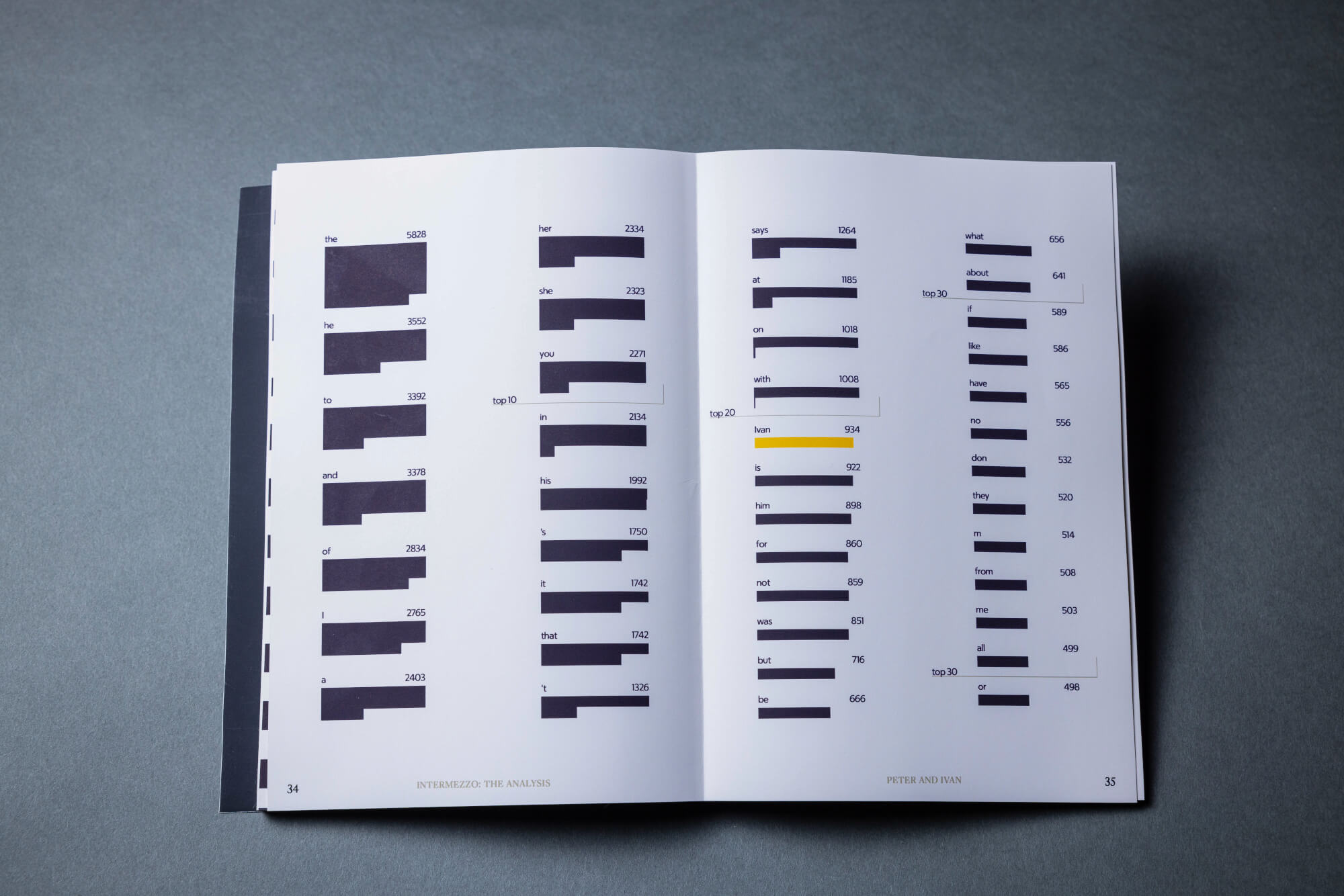
Word Frequency Tool
The Word Frequency Tool is ideal for quantitative, word-based analyses. It analyzes your documents and provides a list of word occurrences, which you can easily export or visualize as a Word Cloud with a single click. Beyond simply counting words, it also displays the percentage of each word’s occurrence and in how many documents it appears. You can further refine your analysis by creating Go-Word-Lists to focus on specific terms and Stop-Word-Lists to exclude irrelevant words. Learn more in our Online Manual.
Autocoding
Autocoding came in handy for the words section. I coded words related to various themes of the novel to compare how the characters engaged with these subjects.
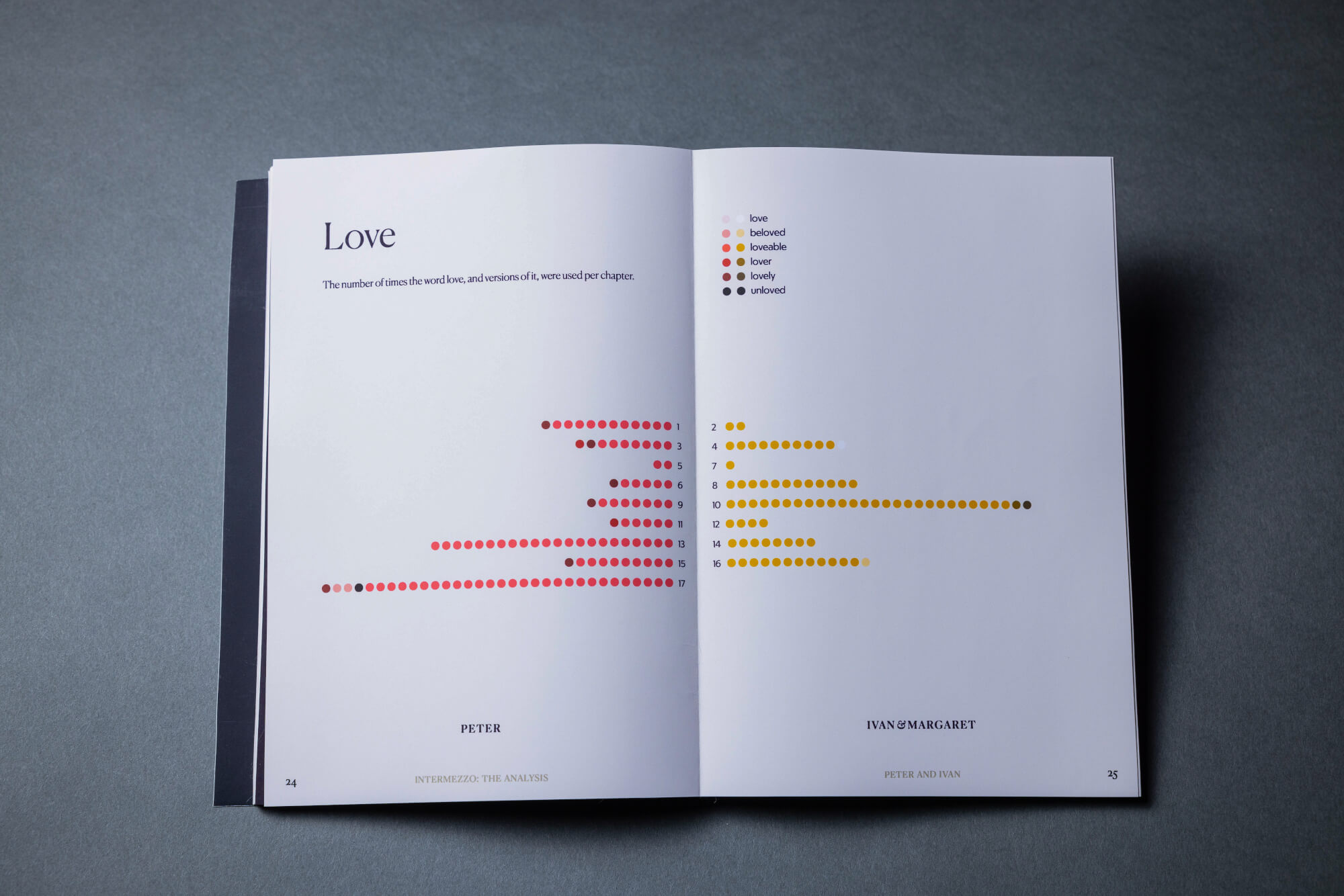
Autocoding
When you need to quickly identify and code instances of a specific concept in your data, MAXQDA’s Autocoding feature is the ideal tool. Simply search for individual words or groups of words, and automatically code all occurrences with a single click, saving you valuable time and effort. This is particularly well-suited when working with large datasets. When you enter a search term, MAXQDA suggests relevant synonyms, ensuring you capture all nuances of a concept or theme. Each search hit is presented within its surrounding sentence, so that it is easy to understand the context. Clicking on a search hit opens the corresponding text segment in the Document Browser, allowing you to delve deeper into its context. Explore the full potential of Autocoding in our Online Manual.
Codeline
The codeline tool helped me vizualize this data in a new way. I created codelines for words used and exported them as svg files. I brought these into Illustrator to reference when I reformed the lines into the standard grid shape used to represent the whole book. This is how I created the word usage visuals.
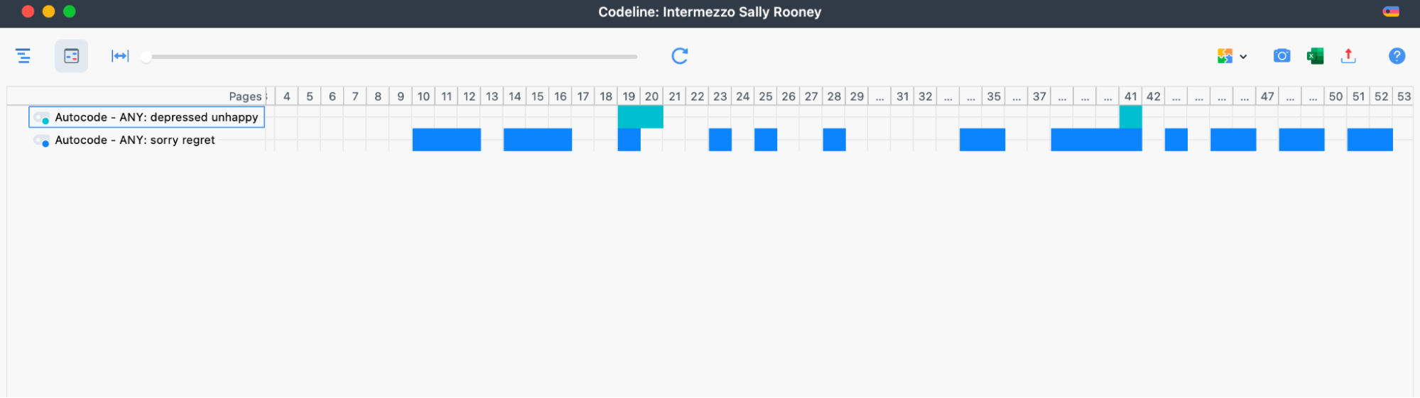
Codeline
The MAXQDA Codeline offers a fast and comprehensive view of the codes assigned to a document. It displays a sequential view of a document’s coded segments allowing you to see at a glance in which sections of your document certain codes (i.e. topics) arise and in which not. In the example above, it becomes clear that the words „sorry/regret“ occur much more often than „depressed/unhappy“ and that both topics do not occur in the beginning of the book Intermezzo. To learn more, visit the Online Manual.
This project may be an unconventional use of MAXQDA, but it was a really fun exploration of how to visualize the data the software can collect. I’m excited to continue to explore ways of visualizing language with the help of MAXQDA!
About the Author
Annika Zitto is a designer, artist, and environmentalist dedicated to using her visual communication skills for positive change. Through educational content, information design, books, and branding, she aims to help people connect with crucial information and causes. Annika Zitto particularly enjoys the opportunity for interdisciplinary collaboration that visual communication design offers, and appreciates the chance to learn from those she works with. Annika Zitto’s project, Intermezzo: The Analysis, has been shortlisted for the Information is Beautiful Awards.
Visit her Social Medias to learn more about her work: