With the help of the Statistics and Graphics module, MAXQDA can create frequency tables and corresponding diagrams for code variables as well as document variables. These functions can be accessed in the following ways:
- from the menu Variables > Statistic of document variables and Statistic of code variables,
- or with the Statistic of document variables
 button on the “MAXQDA standard” toolbar,
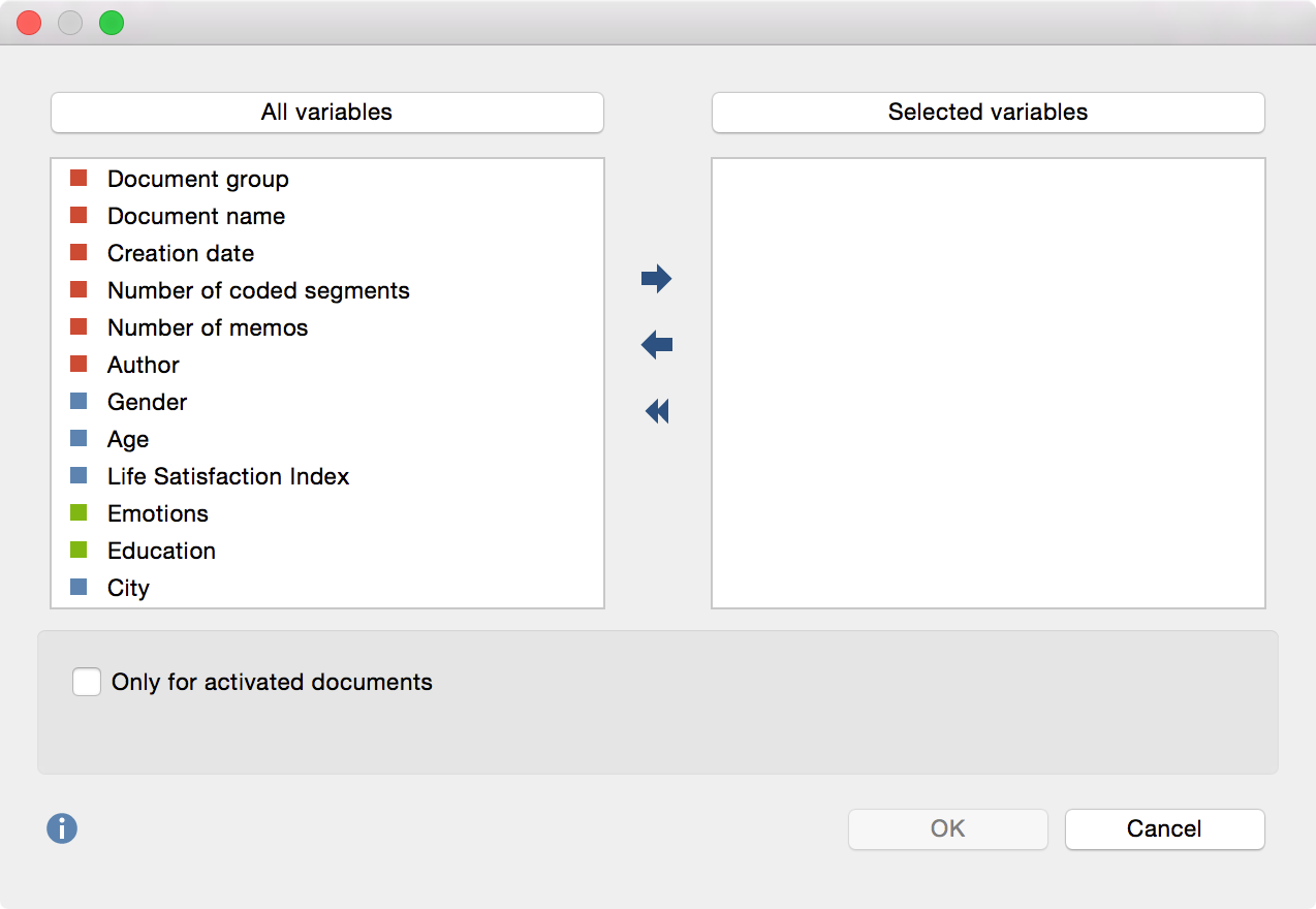
The split “Choose variables” window is displayed below: On the left side, all existing variables are listed; on the right, the selected variables. The arrow buttons in the middle allow you to transfer variables from one window to the other, i.e. for selection for analysis or removal from the selection list. To select multiple variables, hold down the Shift (ñ), Ctrl (Windows) or cmd (Mac) key.

Both lists can be alphabetized by clicking on the column headers. By selecting Only activated documents you can limit the analysis to currently activated documents, for example the transcripts of selected interviewees. The corresponding option Only activated codes is also available.
When you click OK MAXQDA will begin the statistical evaluation and display the results as frequency tables and charts.
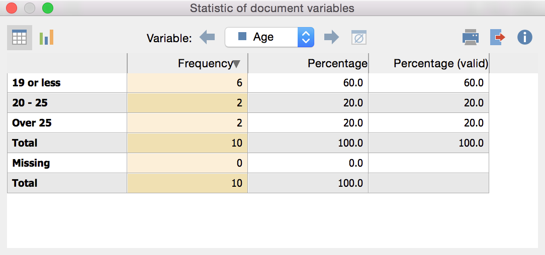
The results window displays the results of the first selection of variables in a table. The “Frequency” column shows how many of the analyzed documents contain the variable value in question.

The first column lists the various categories of the variable; the second column lists the absolute frequency; and the third lists the corresponding percentages. The fourth column shows percentages based on valid values, meaning missing values are excluded. If there are no missing values among the variables in question, the percentages of the third and fourth columns will be identical.
You can customize the order of the rows within the table by clicking on the column header of the first and second columns. For example, you can sort the table in ascending or descending order in regards to categorical frequency.
The results window has a toolbar at the top. From here you can:
- Call up the chart view by clicking the
 button
 - Flip forwards
 or backwards
  between variables
 - Print results, or
- Export results as an Excel file
Charts
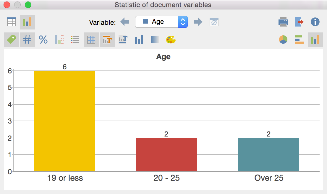
When you switch to the chart view with the ![]() button, a bar chart of the variables in question appears in the place of the table view.
button, a bar chart of the variables in question appears in the place of the table view.

You will see two toolbars at the top of this window. The upper toolbar is the same as the frequency table, and you can switch at any time to the table view. On the right side of the toolbar you will see three buttons, with which you can choose between pie chart, horizontal and vertical bar chart. The chart can be customized using the options in the lower toolbar
![]() Display labels – hide or show categorical labels of bar and pie charts on the x-axis.
Display labels – hide or show categorical labels of bar and pie charts on the x-axis.
![]() Display data values – hide or show the data label, meaning frequency of variable values or subcodes.
Display data values – hide or show the data label, meaning frequency of variable values or subcodes.
![]() Display percentages – show relative, rather than absolute frequencies.
Display percentages – show relative, rather than absolute frequencies.
![]() Display missing values – hide or show missing values category.
Display missing values – hide or show missing values category.
![]() Display legend – hide or show the legend, which is switched “off” by default in bar charts.
Display legend – hide or show the legend, which is switched “off” by default in bar charts.
![]() Display scale – hide or show the scale axis in bar charts.
Display scale – hide or show the scale axis in bar charts.
![]() Display title – hide or show diagram title.
Display title – hide or show diagram title.
![]() Display text – hide or show textual description of diagram.
Display text – hide or show textual description of diagram.
![]() One color – use the same color for all pie or bar chart segments.
One color – use the same color for all pie or bar chart segments.
![]() Color gradient – add color gradient to pie or bar chart segments
Color gradient – add color gradient to pie or bar chart segments
![]() Change color scheme – opens window for color scheme selection.
Change color scheme – opens window for color scheme selection.
Customizing Chart Captions, Color and Font Sizes
When creating charts, MAXQDA sets an initial color scheme. To customize your charts, double-click on the selected segment and choose your desired color. Click on the Change color scheme ![]() button to select between three preset color schemes.
button to select between three preset color schemes.
Double-click on the title or description to customize content.
Formatting, such as font, font size and font style, can be changed via the dialog window that appears when you right-click on the title, description or another label.

Print and Export Charts
Like frequency tables, charts can be printed and exported. Charts will be exported in PNG format, or as vector graphics in SVG format.
Missing Values in Frequency Tables and Charts
MAXQDA will treat the following as missing variable values:
- For numerical and text variables, values set as “Missing values” in the “List of variables” will be treated as missing.
- For text variables, blank fields will also be treated as missing.
- Descriptive Statistics
- When evaluating numerical variables the Descriptive statistics
 symbol is appears in in frequency tables. Clicking on the icon produces an output of the usual parameters such including mean value and variance.
